A gorgeous magazine cover is more than just a facade; it’s a powerful tool that can captivate your audience and propel your publication to the next level. It serves as the initial handshake with a potential reader, a visual promise of the content within. In the realm of graphic design, achieving that perfect cover often involves leveraging specialized software, and while user-friendly platforms like Canva offer accessible solutions, mastering Photoshop unlocks a universe of creative control and professional polish for magazine template design. This guide delves into the intricacies of creating compelling magazine covers using Adobe Photoshop, exploring the fundamental principles, advanced techniques, and essential considerations for crafting layouts that resonate with diverse audiences.
The Foundation of an Effective Magazine Cover
Before diving into the technicalities of Photoshop, it's crucial to understand the core elements that constitute a successful magazine cover. The primary objective is to grab attention and convey the essence of the publication. This involves a strategic interplay of several key components:
- Headline/Masthead: This is the primary identifier of your magazine. It needs to be bold, legible, and instantly recognizable. Its placement, font choice, and color are critical for brand identity.
- Main Image: This is arguably the most dominant element. It should be high-quality, visually striking, and directly relevant to the cover story or the magazine's overall theme. The image sets the mood and tone.
- Cover Lines/Teasers: These are smaller headlines that highlight key articles within the magazine. They serve as enticing previews, encouraging readers to pick up the issue. Their hierarchy, font treatment, and placement are essential for guiding the reader's eye.
- Color Palette and Typography: The chosen colors and fonts contribute significantly to the magazine's aesthetic and brand personality. They should be consistent with the magazine's identity and evoke the desired emotional response.
- White Space/Negative Space: Often overlooked, strategic use of negative space can enhance the impact of other elements, prevent clutter, and improve readability.
Getting Started with Photoshop for Magazine Covers
Photoshop, a professional-grade image editing and graphic design software, offers unparalleled flexibility for creating magazine cover templates. While platforms like Canva provide pre-designed, customizable templates, Photoshop empowers designers to build from the ground up or extensively modify existing designs with precision.
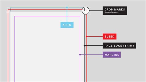
The process typically begins with setting up your document. For magazine covers, a standard resolution of 300 DPI (dots per inch) is recommended for high-quality printing. The dimensions will depend on the specific magazine size, but common formats include US Letter (8.5 x 11 inches) or A4 (210 x 297 mm). It's also crucial to set up guides for the bleed area (typically 0.125 inches or 3 mm), the trim line, and the safe zone to ensure that no important elements are cut off during the printing process.
Once the document is set up, the creative process can commence. This involves importing images, designing text elements, and arranging them harmoniously.
Leveraging Photoshop's Powerful Tools for Cover Design
Photoshop offers a vast array of tools and features that are indispensable for magazine cover creation. Understanding how to utilize these effectively can elevate your designs from amateur to professional.
Image Manipulation and Enhancement
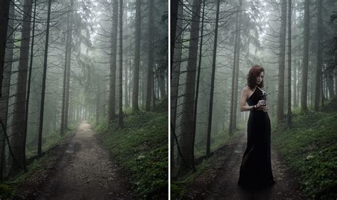
The main image is often the focal point. Photoshop excels at transforming raw photographs into compelling visuals.
- Selection and Masking: Precisely isolating subjects or elements within an image is crucial. Tools like the Quick Selection Tool, Magic Wand Tool, Pen Tool, and Layer Masks allow for intricate selections and non-destructive editing. This enables you to seamlessly composite different images or isolate a subject for emphasis.
- Color Correction and Grading: Adjusting brightness, contrast, saturation, and hue can dramatically alter the mood and impact of an image. Tools like Levels, Curves, Hue/Saturation, and Color Balance are essential for achieving a desired aesthetic. Color grading, in particular, can imbue an image with a specific emotional tone, such as warmth, coolness, or drama.
- Retouching: Removing blemishes, smoothing skin, or correcting imperfections are standard practices. Tools like the Spot Healing Brush, Healing Brush, Clone Stamp, and Patch Tool are invaluable for refining photographic elements.
- Compositing: Combining multiple images to create a surreal or thematic scene is a common technique. Photoshop's layer system and blending modes allow for seamless integration of different visual elements.
Typography and Text Design
Text is not merely informational; it's a design element. In magazine covers, typography plays a critical role in conveying tone, hierarchy, and brand identity.
- Font Selection: Choosing the right typeface is paramount. Serif fonts often convey tradition, elegance, or seriousness, while sans-serif fonts can appear modern, clean, or minimalist. Script fonts can add flair and personality. It’s vital to select fonts that are legible at various sizes and complement the overall design.
- Text Formatting: Photoshop's Character and Paragraph panels provide extensive options for controlling font size, leading (line spacing), kerning (space between specific letter pairs), tracking (overall letter spacing), alignment, and color.
- Text Effects: Applying styles like drop shadows, outlines (strokes), bevels, and glows can add depth and visual interest to text. However, these should be used judiciously to avoid a cluttered or dated look.
- Type on a Path: For more dynamic layouts, placing text along a curved or irregular path can create unique visual effects.
Layout and Composition
The arrangement of all elements on the cover is what brings the design together.
- Grids and Guides: As mentioned, setting up guides is essential. Photoshop's Grid and Guides features help maintain alignment and consistency across design elements, ensuring a professional and organized appearance.
- Layer Management: Keeping your layers organized is crucial for efficient workflow, especially in complex designs. Naming layers descriptively and grouping related elements can save significant time and prevent errors.
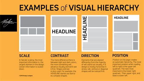
- Hierarchy: Establishing a clear visual hierarchy guides the reader's eye. The masthead should be prominent, followed by the main image and then the most important cover lines. Less critical information should be smaller and less visually dominant.
- Balance and Proportion: Achieving visual balance, whether symmetrical or asymmetrical, is key to a pleasing composition. Understanding principles of proportion helps ensure that elements are sized appropriately relative to each other.
Advanced Techniques for Professional Polish
Beyond the fundamental tools, several advanced techniques can elevate your magazine cover designs in Photoshop.
Incorporating Graphic Elements
Illustrations, icons, and vector graphics can add unique visual flair and symbolism to your cover. Photoshop allows you to import these elements and seamlessly integrate them with photographic content.
- Vector Graphics: Adobe Illustrator is the primary tool for creating vector graphics, which are scalable without loss of quality. These can be imported into Photoshop as Smart Objects, allowing for non-destructive scaling and editing.
- Illustrations: Hand-drawn or digitally created illustrations can provide a distinct artistic touch. Photoshop's brush tools can also be used to create custom illustrations directly within the software.
- Icons: Simple icons can effectively represent concepts or highlight specific article categories. A vast library of icons is available online, and these can be imported and customized in Photoshop.
Utilizing Blending Modes and Layer Styles
Blending modes allow you to control how layers interact with each other, creating sophisticated visual effects. Layer styles, such as inner shadows, outer glows, and satin effects, can add subtle or dramatic embellishments to text and graphic elements. Experimentation with these features can lead to unique and eye-catching results.
Creating Depth and Dimension
Techniques like drop shadows, inner shadows, and the use of gradients can create a sense of depth and make elements appear to pop off the page. Applying these effects subtly can enhance the overall visual appeal without making the design look heavy.
Designing for Different Magazine Categories
The principles of good design remain constant, but the execution will vary depending on the magazine's genre.
- Fashion Magazines: Often feature striking, high-fashion photography. Typography tends to be elegant and sophisticated. Color palettes can be bold or minimalist, depending on the brand. The emphasis is on aspirational imagery and trend-setting content.
- Food Magazines: Typically showcase mouth-watering images of dishes. Warm, inviting color palettes are common. Typography might be more approachable and friendly. The focus is on appetite appeal and culinary inspiration.
- Travel Magazines: Emphasize breathtaking landscapes and vibrant cultural imagery. Typography can range from adventurous and bold to serene and elegant. Color palettes often reflect the destinations featured. The goal is to evoke wanderlust and a sense of exploration.
- Sports Magazines: Utilize dynamic, action-packed photography. Typography is often bold, energetic, and impactful. Color palettes can be strong and contrasting, reflecting the intensity of sports. The emphasis is on athleticism and competitive spirit.
The Role of Templates and Customization
While this guide focuses on using Photoshop from scratch, it's worth noting the concept of magazine cover templates. Many designers utilize pre-made templates as a starting point, then customize them extensively within Photoshop. This approach can save time while still allowing for a high degree of creative control.
For instance, if you find a template with a suitable layout but an image that doesn't fit your needs, you can easily replace the placeholder image with your own. Then, you can adjust the colors, fonts, and cover lines to align with your specific content and brand identity. This iterative process of customization is where Photoshop truly shines. You can come up with a fabulous cover by simply choosing a design from a selection of customizable magazine cover templates and modifying it to fit what you need. Our photo magazine cover templates are free and come in layouts and designs suitable for different categories. You can browse by category or use the search bar to find the perfect template. These free magazine covers and templates can also be personalized and used for fun projects and special occasions. You can always make your magazine front cover as creative as you want.
Photoshop makes that as easy as possible. Once you’ve found the right template, simply use its powerful features to customize your cover. Draw your readers’ attention by editing your text-add emphasis with bold or italics or with different fonts and colors. Add graphic elements to your cover by browsing its immense library of illustrations, vectors, icons, and photos. After editing your magazine cover, you can hit save and download your file to share or print it.
Considerations for Print vs. Digital
When designing a magazine cover, it's essential to consider the final output medium.
- Print: Requires high-resolution images and careful attention to color profiles (CMYK is standard for print). Bleed areas are critical to avoid unwanted white edges after trimming. The tactile experience of print also influences design choices.
- Digital: For online publications or digital previews, resolution requirements might be lower (e.g., 72 DPI for web). RGB color mode is used for digital displays. File sizes are also a consideration for faster loading times. Interactive elements or subtle animations might be incorporated for digital formats.
The Iterative Process of Design
Creating a compelling magazine cover is rarely a one-step process. It often involves several rounds of design, feedback, and refinement.
- Concept Development: Brainstorming ideas and creating initial sketches or mood boards.
- Drafting in Photoshop: Building the initial design, focusing on key elements and layout.
- Seeking Feedback: Presenting the draft to stakeholders or target audience representatives for input.
- Revision and Refinement: Making adjustments based on feedback, tweaking colors, typography, and image placement.
- Finalization: Preparing the file for print or digital distribution, ensuring all technical requirements are met.
This iterative approach, facilitated by Photoshop's robust editing capabilities, allows designers to explore various options and arrive at the most effective solution.
The Future of Magazine Cover Design
As technology evolves, so do the tools and possibilities for magazine cover design. Augmented reality (AR) is beginning to offer new avenues for interactive covers that come to life when viewed through a smartphone. 3D elements and dynamic typography are also becoming more accessible. However, the fundamental principles of strong visual storytelling, clear communication, and aesthetic appeal remain the bedrock of impactful magazine cover design, regardless of the medium or the software used. Photoshop, with its continuous updates and feature enhancements, continues to be a leading platform for designers to push these boundaries.