When you've ever sent an image to print, you will have invariably seen a tick box or drop-down list titled ‘Rendering Intents’. If you try and avoid looking at it in case it does something unexpected and think it’s easier to leave plain alone, then please read on. This article explains exactly what on Earth they are and how they can dramatically help with your own printing.
What is a 'Rendering Intent'?
A rendering intent is fundamentally a method of converting colours from one ICC profile to another. They are designed to deal with the inherent problems of converting from one colour space to another, particularly when there are colours that exist within the gamut (the range of colours) of the source profile but fall outside the gamut of the destination profile. In such situations, these "out-of-gamut" colours need to be brought into the destination's gamut.
For photographers, the primary scenario where you'll encounter the need to choose a rendering intent is when applying an ICC Profile within software like Photoshop, Lightroom, or other imaging applications. This is most commonly encountered when transitioning from a larger colour space (like that captured by your camera's sensor or a wide working space like Adobe RGB or ProPhoto RGB) to a smaller colour space, such as that of a printer profile. The rendering intent effectively "squeezes" and shrinks the colour gamut of the source profile so that it fits within the smaller volume of the destination. This process involves changing all colours to some extent, compressing the gamut much like deflating a balloon to fit it into a box.
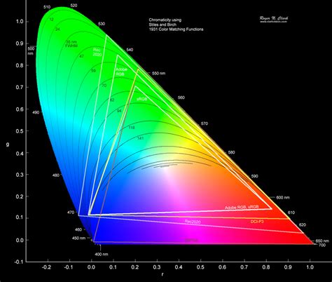
The choice of rendering intent significantly impacts the final output, and understanding their differences is crucial for achieving predictable and pleasing print results. The ICC (International Color Consortium) defined four primary rendering intents, each with a specific strategy for handling colour conversions. These intents do not adhere to a strict standard but rather specify a condition for conversion, meaning the outcome can vary depending on the chosen intent, much like how the colours of an analog film can differ based on the manufacturer and development process.
The Four ICC Rendering Intents Explained
The ICC defined four rendering intents, each offering a different approach to colour conversion. These are Perceptual, Relative Colorimetric, Absolute Colorimetric, and Saturation.
1. Perceptual Rendering Intent
The big advantage of perceptual rendering is that the relationships between colours are maintained. Generally, colours become less saturated in the smaller destination gamut, but the saturation relative to other colours within the image is preserved. With perceptual rendering, both in-gamut and out-of-gamut colours are moved, and their relative differences are kept intact. This method "compresses" all colours of the source colour space into the usually smaller output colour space. Colours that can be represented in both colour spaces are also shifted in the process. The image representation is maintained thanks to an even compression of all colour values of the larger source colour space into the smaller destination colour space. In other words, there are slight colour changes across the entire colour space, but there is no simple "clipping" at the edge of the colour space; instead, even colour spacing is maintained. A gradient still appears uniform, even if it no longer matches the original 100% in colourimetric terms. The conversion is non-linear, and saturated colours are compressed more than unsaturated ones. The reason for this is that colour changes in less saturated colours are perceived more intensely by the human eye than deviations in saturated colours. This also acknowledges the smaller range of colours in print, which may evolve into a pale-looking depiction. Despite this, perceptual is a legitimate choice for converting RGB to CMYK. When converting an image for printing on paper, the conversion is often perceptual. In Photoshop, in the section “Conversion Options” of the Color Settings (menu “Edit”), you will find “Priority”, which you should set to “Perceptual”.
This rendering intent is often used when converting from a large RGB colour space to a smaller CMYK colour space, especially for images with a wide range of colours where preserving the overall visual harmony is paramount. For instance, a landscape image with a vast array of subtle colour transitions would benefit from perceptual rendering to ensure gradients remain smooth and colours don't appear unnaturally clipped.
2. Relative Colorimetric Rendering Intent
Relative Colorimetric rendering ensures that colours that are within the destination gamut are reproduced as accurately as possible. However, colours that are out of gamut are simply translated to the closest possible colour that is within the gamut. They are essentially "clipped" to the outer edge of the colour space. This means that two different colours in the original image could end up being rendered as nearly the same colour in the output. As an analogy, it’s like slicing a ball to get it to fit into a box. If we convert two colours, A and B, from the Adobe RGB colour space to that of an inkjet paper profile, and if colour A is out of gamut and colour B is in gamut, then colorimetric rendering would leave the in-gamut colour B as it is but shift colour A into the gamut. Two colours that were very different could end up being similar.
This method is particularly useful for images where colour accuracy is critical, and the preservation of specific hues is more important than maintaining the exact relationships between all colours. It is often used when converting from CMYK to CMYK, from a smaller source colour space to a larger target colour space, or for digital proofing on standard printing paper. The output colour space must be at least the same size as the reference colour space for colours to be converted accurately.
When converting two colours, A and B, from a larger colour space to a smaller one, and if colour A is out-of-gamut while colour B is in-gamut, Relative Colorimetric would leave B unchanged but move A to the nearest reproducible colour. This can result in colours that were once distinct becoming very similar.
This rendering intent also works equivalently to the relative colorimetric rendering intent but can additionally simulate the white point (paper white). It is used for digital proofs on special production paper (not the usual copy paper) or for displaying the print preview on screens. If an image is printed on a digital printer with more than the usual four colours, select absolute colorimetric. This method considers both the paper white and the absolute colour values, which ensures that the digital proof is aligned to the final printed result in most conventional printing techniques.
Absolute Colorimetric Rendering Intent
As a photographer, you should generally avoid using absolute colorimetric rendering; it is primarily intended for pre-press proofing. This method converts colours from the source to the target colour space, including the white point. It maps colours as precisely as possible, and out-of-gamut colours are relocated to their nearest in-gamut colour at the outer perimeter of the output colour space. This procedure leads to high accuracy in colour-corresponding areas of the two systems but can occasionally lead to banding and issues in the border area, e.g., with gradients.
This rendering intent is used when converting from CMYK 1 to CMYK 2, from a smaller source colour space to a larger target colour space, or for digital proofing on normal printing paper. The output colour space must be at least the same size as the reference colour space so that the colours are converted accurately. If you intend to render a soft proof on the monitor, select the relatively colorimetric rendering intent. This conversion method first analyzes the white point of the source and the target, and then converts the colours based on this. Again, the colours are clipped at the edge of the output colour space, which can cause very bright hues to fray. The colours, however, are rendered brilliantly and brightly, so you should use relatively colorimetric, which may engender a similar outcome to the saturation-preserved method.
3. Saturation Rendering Intent
The Saturation rendering intent is similar to Perceptual but, in addition to squeezing the colour into the smaller colour space, it tends to make the colours more saturated. The effect is quite subtle and very usable for images where you want to enhance colour saturation. To continue the box analogy, imagine deflating a balloon slightly to get it in the box and then re-inflating it so it fills the box as much as possible. Each colour is changed again, but the saturation of the colour is prioritised.
In the graphics industry, this rendering intent is commonly not a preference, as it favours a vivid reproduction of graphics at the expense of colour accuracy. It is, however, well-suited for printing and subsequently predestined for transitions from RGB to CMYK when "vivid" colours are preferred over colour precision. Especially invigorating or bright colours are reproduced particularly well in print, because it converts the colours in the range of saturation in the best viable way. However, other attributes such as brightness, etc., are altered in the process, often at the expense of the colour tones. Presentations in which the colour tone is not critical would be suitable for this conversion method.
This intent is ideal for images where vibrant colours are the main focus, such as those featuring bright flowers, tropical scenes, or sports photography. It aims to maximize the "punch" of the colours, making them appear more vivid and eye-catching, even if it means a slight deviation from absolute colour accuracy.
Black Point Compensation
When using rendering intents in Photoshop, you will also see an option called Black Point Compensation (BPC). It should always be used because it converts the tonal range of the source colour space into the tonal range of the destination to avoid tones being clipped. Black Point Compensation is always used by Lightroom and other Adobe software, even when it isn't visible as an option. It ensures that the darkest tones in your image are mapped appropriately to the darkest tones available in the output device's colour space, preventing shadow detail from being lost or "filled in" during the conversion process. This is particularly important when printing to media with a smaller dynamic range than your display.
Which Rendering Intent to Use, When?
Anyone that tells you to only ever use one rendering intent doesn’t fully understand how they work. Which one to use depends entirely on the specific image, the source colour space, and the destination colour space. There are no restrictive conversion methods for converting an image captured in RGB to CMYK. Depending on the image attributes and the output device, there are various methods you can use to achieve the best possible results. To ascertain an optimized transition from reference to target device, the ICC developed rendering intents.
Let's imagine you are using a very good semi-gloss paper like PermaJet’s FB Distinction 320gsm to print a variety of photos.
Subtle Tones
If you have a nice shot from the studio of two models with subtle tones in the background - perhaps a grey background, flesh tones, and soft hair - these colours may well be within the gamut of the printer. In this case, the ‘Relative Colorimetric’ option would be an appropriate choice to maintain the delicate nuances of the tones.
Block Tones
Consider a picture of a bride in her white dress against a dark background. To retain the detail in the dress and still have detail in the shadows, the ‘Perceptual’ option might be best. This is because Perceptual rendering excels at preserving the relationships between colours, ensuring that both the bright highlights of the dress and the deep shadows are rendered pleasingly without significant loss of detail.

Punchy Colour
Lastly, imagine a picture with bright, vibrant colours across different areas. To deliver as much "punch" in the colours as possible, choose the ‘Saturation’ option. This will enhance the vibrancy of the colours, making them stand out.
Landscapes
For a landscape shot taken in an autumnal wood, with varied colour in the foliage and lots of contrast from sunlight streaming through the trees, printed on a beautifully smooth, matt surface like PermaJet’s FB Matt 285gsm, you should try all three intents (Perceptual, Relative Colorimetric, and Saturation) to see which gives you the most pleasing print. Each will be slightly different, and each intent may just bring out some part of the image slightly better than the others.

Other Factors to Consider
Gamut Warning Functions
You can often use the gamut warning function in Photoshop or Lightroom, along with the soft proofing function, to help you decide which rendering intent might be best. Lots of out-of-gamut colours might imply that the shot would look best printed with ‘Perceptual’ or ‘Saturation’. If few colours are out of gamut, then ‘Relative Colorimetric’ may be suitable. A gamut warning view (such as that in Photoshop) will highlight areas that are out of gamut, often in grey. Images with large areas of out-of-gamut colour may be more suitable for Perceptual or Saturation rendering.
Colour Space
The image’s colour space can also play a part. If you are using a small colour gamut working space such as sRGB, you may see very little difference between the intents because much of the colour information from the camera may have already been lost. You’ll see a greater difference if you use Adobe RGB or ProPhoto RGB, or if you process your images in software that uses a wide gamut working space like Lightroom.
Inkjet Paper
Generally, the glossier the paper, the larger the colour gamut it can reproduce. So, if you are using a gloss or semi-gloss paper, more colours from an image may be in-gamut. Conversely, if you are using a matte paper, you may get more benefit from trying Perceptual or Saturation rendering because more colours may be out of gamut (depending on the image, of course!).
Screen to print: how I prepare images in Photoshop
Conclusion on Rendering Intents
You may find it frustrating that there isn't a single, definitive recommendation for one rendering intent over another, or that colour management offers so much choice rather than straightforward accuracy. You have to realize that when converting colours into a smaller colour space, compromises must be made. Having a choice of rendering intent allows you to choose what you prioritize in the image: contrast, saturation, accuracy, or highlight/shadow detail.
If you really have to be told to just use one intent, then Relative Colorimetric can be safe enough most of the time, if you’re not too precious about the print. However, if you are looking to get the very best print you can - for example, for a photo club competition - then my advice would be to print the image using Perceptual and Relative Colorimetric, and also Saturation if the image contains lots of vivid colour. Experimenting with soft proofing and test prints is the best way to determine the ideal rendering intent for each specific image and output medium.