At its core, the Calibration panel in Adobe Lightroom is fundamentally about the initial conversion of raw image data into the RGB rendering that we see on our screens. While Adobe's introduction of camera raw profiles has largely streamlined this process, the Calibration panel remains an incredibly powerful, yet often misunderstood, tool for photographers. It offers a granular level of control over how your camera's color interpretation is rendered within Lightroom, allowing for both precise corrections and significant creative manipulation.
The Genesis of Calibration: From Raw Data to RGB Rendering
The term "Calibration" itself hints at its original purpose: to ensure that the colors displayed within the software accurately reflected how the image appeared straight out of the camera. This was particularly crucial in the early days of digital photography when raw converters had a more rudimentary understanding of camera-specific color science. At a basic level, it’s called Calibration because it affects the initial conversion from the raw data to the RGB rendering. This function was more effectively addressed when Adobe added camera raw profiles.
However, the Calibration panel's utility extends far beyond mere accuracy. It delves into the very essence of how colors are captured and interpreted, a concept deeply rooted in "color science." Every pixel in a digital image is a combination of red, green, and blue light. Color science, in essence, is the interpretation of these combinations by a given camera manufacturer. When photographers comment on how "Canon's skin tones are better," or that "Sony's are more true to life," or that "Fujifilm's skies are too blue," they are, in effect, discussing the distinct color science baked into each camera brand. This "baked-in" opinion of colors is applied every single time you press the shutter, whether you're shooting in RAW, JPEG, or any other format.
Understanding Color Science: The Foundation of Calibration
To truly grasp the Calibration panel, one must first understand what "color science" means in practice. Consider the question of how a specific shade of blue is determined. What precise mixture of red, green, and blue light constitutes that particular shade? And is that shade identical across different camera manufacturers' outputs? When someone expresses a preference for a particular brand's rendition of skin tones, they are often referring to how that brand prioritizes saturation in specific color channels. For instance, a preference for "Canon skin tones" might mean that Canon cameras tend to put more saturation into their red pixels, giving skin tones a bit more "pop," even if it means other colors in the image are slightly less accurate. This is inherently subjective, resting on the photographer's personal aesthetic and definition of what looks "best."
The concept extends to more nuanced observations, such as the acclaimed "cinematic Sony Venice Look." This refers to a specific, pleasing combination of reds, greens, and blues in each individual color that creates a distinctive mood and feel. This unique rendition of color is a direct result of the camera manufacturer's proprietary color science.
The Calibration Panel: A Tool for Adjusting Color Interpretation
The Calibration tool in Lightroom is precisely that: a tool used to adjust these underlying color values. It allows you to alter the mixture of red, green, and blue within each pixel, enabling you to tailor the color rendition to better suit the scene, the lighting conditions, or your personal stylistic vision. When used effectively, the Calibration tool can even help you achieve the "Canon look" without actually shooting with a Canon camera.
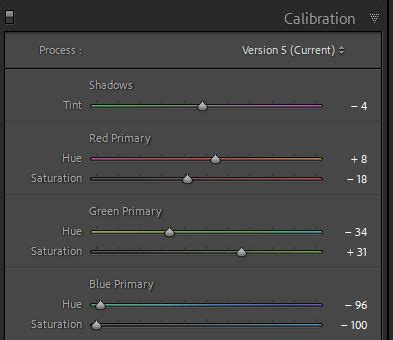
A key distinction often missed is that the Calibration panel targets the R, G, and B values of each pixel, not just generalized "red," "green," or "blue" pixels as one might find in other editing tools. This targeted approach is what makes it so powerful.
Beyond HSL: Why Calibration Differs
A common misconception is that the Calibration panel is simply another way to adjust colors, akin to the HSL (Hue, Saturation, Luminance) panel. While both panels deal with color, they operate on fundamentally different principles. The HSL panel typically controls specific color ranges (e.g., all reds, all blues). In contrast, the Calibration panel, by adjusting the primary color channels, influences the overall color interpretation at a deeper level.
While the exact colorimetric mechanisms can be complex and are best explored in detail by color science experts like Jeff Schewe in his book "The Digital Negative," the practical application is clear. The sliders in the Calibration panel allow for micro-adjustments and fine-tuning of the camera's raw converter's color interpretation for a particular camera or even a specific image.
Practical Applications: Skin Tones, Color Casts, and Creative Styling
The Calibration panel proves invaluable in several practical scenarios. One of its most recommended uses is for skin tone correction. In uncontrolled environments, skin tones can easily pick up undesirable hues from their surroundings. The Calibration panel, particularly the hue sliders, can make a significant difference in subtly correcting these casts without affecting the actual colors of objects that are meant to be that hue. For example, you can remove a yellow color cast from an image without altering the yellow of a sign that is supposed to be yellow.
Color Correction for Concert Lighting - Fixing Extreme Color Tints in Adobe Lightroom
Beyond correction, the Calibration panel is also a potent tool for major stylistic color changes. Imagine wanting to shift all green and yellow tones in an image to be more uniformly green. The Calibration panel can achieve this. While not always a desirable outcome for every image, it demonstrates the artistic freedom the tool provides.
For photographers seeking a unique aesthetic, the Calibration panel can be instrumental. One personal style might aim for a "cobalt blue, orangey kind of feel" rather than the ubiquitous "teal and orange" look. By homogenizing various colors within a scene into a desired palette, such as blues and oranges, the Calibration panel allows for the creation of a signature style. This can be seen in an example where a wall of books with a multitude of colors is transformed to feature primarily blues and oranges.
Accessing and Utilizing the Calibration Panel in Lightroom CC
For users of Lightroom CC, the Color Calibration section might not always be immediately visible. Here's how to ensure you can access and utilize this powerful feature:
Step 1: Accessing the Color Calibration SectionOpen your Lightroom CC application and navigate to the Edit section (or press 'E' on your keyboard). This is your primary editing workspace.
Step 2: Revealing the Hidden SectionWithin the Develop module, look towards the right-hand toolbar. You'll find three dots ("…"). Clicking on these dots will open a dropdown menu containing additional options. From this menu, select "Show Color Calibration." This action will reveal the Color Calibration section, typically located beneath the Color Grading panel, making it ready for your adjustments.
Once visible, the Color Calibration section offers sliders for the red, green, and blue primary colors. These sliders allow you to fine-tune the mixture of light that constitutes the colors within your image. It's important to remember that these are global adjustments, meaning any changes you make will affect every pixel in the photograph. This global nature distinguishes it from local adjustments made with tools like the HSL panel.
Experimentation and Further Learning
The true power of the Calibration tool lies in experimentation. By adjusting the sliders, you can observe how the overall color balance of your image shifts. This is where your creative vision comes to life, whether you're correcting subtle color casts, enhancing specific tones, or crafting a distinctive artistic look.
For those who wish to delve deeper, numerous online tutorials and articles offer detailed walkthroughs, creative tips, and insights into the tool's functionality. Resources such as Blake Rudis's f64 Academy channel on YouTube and Anthony Morganti's videos provide excellent explanations and practical examples of using the Calibration panel. Exploring these resources can significantly enhance your understanding and mastery of color calibration in Lightroom.
Ultimately, the Calibration panel is not just about adjusting colors; it's about understanding and manipulating the fundamental color science that underpins your images. It offers a level of control that can help you realize your photographic vision, whether your goal is absolute accuracy or bold artistic expression.
tags: #where #is #calibration #in #lightroom