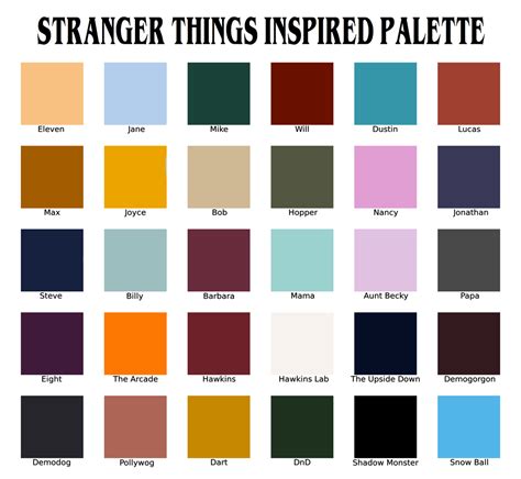
The digital landscape is awash with visual trends, but few possess the distinct, almost uncanny allure of the "Stranger Things" aesthetic. This style, characterized by its moody, desaturated palettes punctuated by vibrant, inverted color pops, has captured the imagination of many. Whether you've stumbled upon these mesmerizing images on platforms like Tumblr or are simply drawn to their unique visual language, the desire to replicate this effect is understandable. Fortunately, with the right tools and techniques in Photoshop, achieving this captivating look, and even animating it into dynamic GIFs, is well within reach. This tutorial will guide you through the process, from understanding the core principles of color inversion to advanced layering and animation strategies.
The Art of Color Inversion: Beyond a Simple Click
At its heart, inverting colors is akin to viewing a photographic negative. In Photoshop, this action is straightforward, but to truly capture the "Stranger Things" essence, a more nuanced approach is often required. The show's distinctive color grading often features deep blues, reds, and blacks, frequently with a subtly desaturated feel. Therefore, before you even consider inverting, it's beneficial to establish these foundational tones. This can be achieved by adjusting your image's overall color balance or by employing adjustment layers such as 'Hue/Saturation' or 'Color Balance' to precisely dial in those specific hues. For instance, you might begin by deepening the blues and reds present in your original image, perhaps applying a slight desaturation, and then proceed with the inversion. This pre-inversion manipulation ensures that the subsequent inverted colors have a richer, more intentional base to spring from, leading to a more authentic and visually striking result.
Achieving the "Stranger Things" Vibe with Adjustment Layers
To truly master the inverted color effect, especially when aiming for a specific stylistic influence like "Stranger Things," leveraging Photoshop's adjustment layers is paramount. Instead of a direct, one-size-fits-all inversion, consider a multi-layered approach. Start by selecting your base image and applying an adjustment layer. The 'Hue/Saturation' adjustment layer is a versatile tool here. Within this layer, you can significantly alter the saturation of specific color channels, allowing you to mute vibrant tones or enhance more subdued ones. For example, reducing the overall saturation can contribute to that characteristic desaturated, moody feel.
Next, the 'Color Balance' adjustment layer offers granular control over the color shifts. You can push the cyan-red, magenta-green, and yellow-blue sliders to introduce specific color casts. To emulate the "Stranger Things" look, you might increase the blue and cyan sliders in the shadows and midtones, while perhaps adding a touch of red to the highlights. Experimentation is key; subtle shifts can have a dramatic impact on the final mood of the image.
Once you've refined the base colors, you can then apply the 'Invert' adjustment, typically found under 'Image > Adjustments > Invert' or by creating an 'Invert' adjustment layer. This will flip the colors of your image. The magic happens when you combine these steps. By first establishing a specific color palette with adjustment layers and then inverting, you achieve a far more sophisticated and tailored result than a simple direct inversion. The interplay between the pre-adjusted colors and their inverted counterparts creates those unique, otherworldly tones that define the aesthetic.
How to Color Grade in Photoshop /Camera Raw Color Grading Tutorial Malayalam
Enhancing the Effect: Blend Modes and Opacity
Once you have your base image and have applied the desired color adjustments and inversion, the next step involves refining the integration of these elements. This is where blend modes and opacity become your most valuable allies. If you've applied your inversion as a separate layer, or if you've used adjustment layers, you can experiment with their blending modes.
The 'Lighter Color' blend mode, as mentioned in the user's provided workflow, can be particularly effective. When applied to an overlay or an adjustment layer, 'Lighter Color' essentially looks at the color information in each of the layers and takes the lighter of the two. This can be useful for creating subtle glowing effects or for integrating inverted elements without completely overpowering the original image.
However, the true power lies in experimentation. Don't limit yourself to 'Lighter Color.' Consider other blend modes such as 'Screen,' 'Overlay,' or 'Soft Light.' 'Screen' can brighten the image and is excellent for integrating light-based overlays. 'Overlay' and 'Soft Light' both increase contrast and saturation, but in different ways, and can be used to make the inverted colors pop more dramatically against the base image.
Opacity is equally crucial. Setting the opacity of your adjustment layer or overlay to 50%, as suggested, is a good starting point. This allows the underlying image to show through, creating a more blended and less harsh effect. By reducing the opacity, you can achieve a more subtle integration of the inverted colors, making them feel like an inherent part of the image rather than an applied filter. Play around with different opacity levels - 30%, 70%, or even lower - to find the perfect balance that achieves the desired mood and visual impact. The goal is to make the inverted colors feel like an intentional artistic choice, not an accident.
Bringing Motion to the Madness: Creating Inverted GIFs
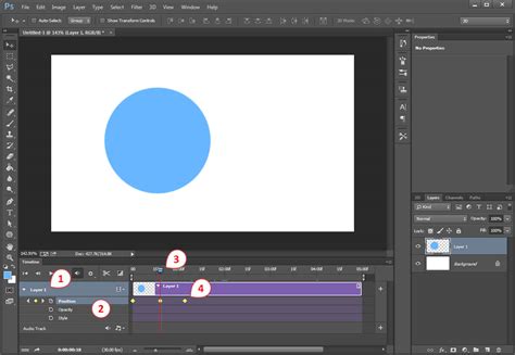
The allure of the "Stranger Things" aesthetic is often amplified when animated, and Photoshop's robust tools for GIF creation make this entirely feasible. The 'Timeline' panel is your central hub for animation. To create a looping GIF where colors transition from normal to inverted and back, you can employ a layer-duplication strategy.
Begin by setting up your image with the desired color adjustments and inversion effects. Once you're satisfied with the static result, duplicate your layer or group of layers. On one of these duplicates, invert the colors. Then, open the 'Timeline' panel (Window > Timeline). Select 'Create Frame Animation.'
You'll want to create at least two frames. The first frame should display your original, non-inverted image. The second frame should display the inverted version. To achieve a smooth transition, you can utilize Photoshop's 'tweening' feature. Select the first frame, then click the 'tween' button (it looks like a small box with lines). Choose the number of frames you want to insert between your existing frames and ensure that 'Opacity' and 'Position' are checked, and crucially, that your 'Invert' adjustment is set to be active for this tween. This will generate intermediate frames that smoothly transition the color inversion.
For a more dynamic feel, you can combine this color-shifting animation with other elements. Perhaps you're incorporating text or other graphical elements. You can animate their opacity or position as well, creating a multi-layered animation. The key to a successful GIF is controlling the frame duration. Experiment with different durations for each frame - perhaps 0.1 seconds for rapid flashes of inverted color, or 0.5 seconds for a more gradual shift. Too fast, and the animation can be jarring; too slow, and it might lose its impact.
Advanced Techniques: Overlays and Generative Fill
For those seeking to push the boundaries of their creations, Photoshop offers advanced techniques that can elevate an already impressive inverted color GIF. One such technique involves the use of overlays. Overlays are pre-made graphical elements, often with transparent backgrounds or specific blending properties, that can be layered onto your existing image or GIF to add texture, light effects, or thematic elements.
As demonstrated in a common workflow, you can acquire an overlay (e.g., a VHS glitch effect, light leaks, or film grain) and ensure it has the same number of frames as your base GIF. Place the overlay screencaps above your base GIF in the Photoshop layers panel. The key to seamlessly integrating an overlay often lies in its background. If the overlay has a gray or black background that you wish to remove or blend, adjustment layers become essential. A 'Selective Color' adjustment layer, for instance, can be used to manipulate the black values. By increasing the 'Black' slider within the 'Black' tab of the 'Selective Color' adjustment, you can deepen the blacks and effectively make them more transparent when combined with certain blend modes.
Once your overlay is positioned and its background is treated, you'll experiment with its blend mode and opacity. As previously discussed, 'Lighter Color' can be effective, but 'Screen' is also a popular choice for light-based overlays as it effectively blends them with the underlying image. Adjusting the opacity, often to around 50%, allows the overlay to add its effect without overwhelming your GIF.
Furthermore, the advent of 'Generative Fill' in Photoshop opens up entirely new creative avenues. This AI-powered tool can be used to add elements or even entire backgrounds to your scenes. Imagine creating a base GIF, then using 'Generative Fill' to add a spooky, otherworldly landscape. You could then apply your inverted color effect and animation over this generated scene, creating a truly unique and immersive visual experience. The power lies in combining the precise control of traditional Photoshop tools with the generative capabilities of AI, allowing for unprecedented creative freedom.
Experimentation and Personalization: Your Unique Inverted Vision
Ultimately, the journey to mastering the inverted color effect and creating compelling "Stranger Things"-inspired GIFs is one of continuous exploration and personal expression. While this guide provides a framework and outlines key techniques, the most impactful results often come from venturing beyond the prescribed steps.
Don't be afraid to experiment with the order of operations. What if you apply a subtle blur before inverting? How does adding a noise filter affect the texture? Explore different combinations of adjustment layers. Perhaps a 'Curves' adjustment layer, offering even more precise control over tonal ranges, could be used in conjunction with 'Hue/Saturation' and 'Color Balance.'
When it comes to animations, play with frame rates and transition types. Instead of a simple fade, could you implement a glitch effect or a rapid strobe? Consider the emotional impact of your choices. The "Stranger Things" aesthetic is often associated with mystery, nostalgia, and a touch of the uncanny. Your animations and color choices should aim to evoke these feelings.
Remember that the goal is not just to replicate a style but to internalize its principles and apply them to your own creative vision. The tools within Photoshop are powerful, but they are most effective when wielded with intention and a willingness to discover what works best for your specific project. So, take your favorite photograph or video clip, open up Photoshop, and begin the exciting process of deconstructing, inverting, and re-imagining your visual world. The possibilities are as boundless as your imagination.