Creating visually appealing text is a cornerstone of graphic design, and Procreate offers several powerful methods for achieving dynamic typography, including the popular effect of curved text. Whether you're designing a logo, a social media graphic, or an illustration, knowing how to bend and shape your text can elevate your work from ordinary to extraordinary. This guide will walk you through various techniques for curving text in Procreate, from simple adjustments to more intricate manipulations, ensuring you can achieve the desired aesthetic for any project.
Importing and Adding Text in Procreate
Before you can begin curving text, you first need to add it to your canvas. Procreate supports a wide variety of fonts, and importing them is a straightforward process. Many resources offer excellent font pairings, such as the Helton font family, which can add a professional touch to your designs. For this tutorial, we'll assume you've already imported your chosen font.
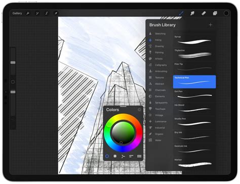
To add text, navigate to the Actions menu (the wrench icon) in the top toolbar. Tap on "Add" and then select "Add Text." This will bring up a text box on your canvas. You can then type your desired text. For demonstration purposes, we'll use "Design Bundles" as our example text. Procreate also offers a wealth of resources like Procreate Palettes and Procreate Brush sets that can further enhance your digital creations.
Method 1: Curving Text with the Liquify Tool
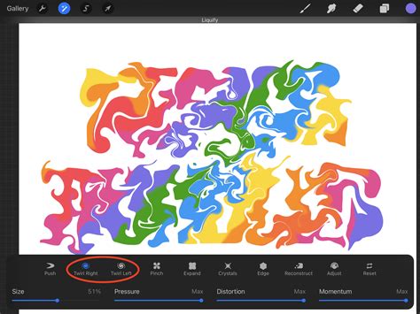
The Liquify tool in Procreate is a versatile instrument that allows for fluid manipulation of pixels, making it an effective method for bending text. While it offers a quick way to achieve a curved effect, it requires a bit of practice to master the precise amount of distortion.
Enabling and Adjusting the Liquify Tool
Begin by ensuring your text layer is selected in the Layers panel. Then, tap on the Adjustments button (the magic wand icon) and choose "Liquify." Within the Liquify toolbar at the bottom, select the "Push" brush. This brush functions similarly to a smudge tool, but instead of blending pixels, it displaces them.
The key to using the Push brush effectively for text curving lies in its size. You need a brush size that is large enough to affect a significant portion of the text for a smooth curve, but not so large that it distorts more than you intend. Experimentation is crucial here; a brush that's too small will result in minimal curving, while one that's too large can lead to unwanted stretching and distortion. While this tutorial focuses on the Push mode, Procreate's Liquify tool offers other features worth exploring in dedicated tutorials.
Applying the Push Brush for Text Curvature
With the Push brush configured, you can now begin to curve your text. By drawing strokes with the brush, you are essentially pushing the existing pixels in the direction you desire. It's important to remember that you are not drawing the curve itself but rather manipulating the text's form by nudging its constituent pixels.
For enhanced precision, it is highly recommended to enable the "Brush cursor" option in Procreate preferences (accessible via Actions > Prefs). This feature displays an outline of your brush on the canvas, allowing you to see exactly where your strokes will impact the text. This visual cue is invaluable for achieving controlled and accurate curves.
Important Note: Once you apply the Liquify tool to a text layer, it becomes rasterized. This means the text is converted into pixels, and you will no longer be able to edit the text content itself. Therefore, it is a critical precaution to duplicate your text layer before using the Liquify tool. This ensures you always have a backup of the editable text if you need to make changes later.
Method 2: Curving Text with the Warp Tool
The Warp tool provides a more structured approach to bending and shaping text, offering greater control through a mesh system. This method involves manipulating nodes within a grid to distort the text layer.
Setting Up Guides and Aligning Text
Before engaging the Warp tool, it's beneficial to sketch some guide lines on your canvas. These lines will serve as a visual reference for the desired curve. Draw them horizontally, ensuring they are centered on your canvas. Then, position your text layer between these guides, also horizontally centered. This alignment will help you achieve a more symmetrical and balanced curve.
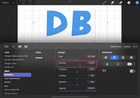
Utilizing the Warp Tool and Advanced Mesh
With your text layer selected, tap the Transform tool (the arrow icon). In the toolbar at the bottom, select "Warp." For finer control, choose "Advanced Mesh." This will overlay a grid onto your text. You will see blue dots at the intersections of the mesh lines.
To curve your text, you will manipulate these blue dots. Dragging the dots allows you to bend and shape the underlying text. For symmetrical curves, aim to keep the placement of the blue dots symmetrical on both sides of your text. For instance, if you're creating an arch, the dots on the left and right sides should mirror each other. While achieving perfect symmetry can be challenging, especially with complex curves, careful adjustment of the mesh nodes will yield impressive results.
Important Note: Similar to the Liquify tool, applying the Warp tool rasterizes the text layer. Consequently, you will lose the ability to edit the text content. Always duplicate your text layer before using the Warp tool to preserve an editable version.
Method 3: Manually Adjusting Each Letter
For the utmost precision, especially when maintaining consistent letter sizes and shapes, manually adjusting each letter is the most effective, albeit time-consuming, method. This technique is particularly well-suited for non-script fonts where individual letter manipulation is feasible.
Creating Guide Lines and Disabling Snapping
As with the Warp tool method, begin by sketching guide lines to inform your desired curve. Center these lines horizontally on your canvas and position your text between them.
With the text layer selected, tap the Selections button (the dotted square icon). Then, select a single letter by drawing around it using the Freehand, Rectangle, or Ellipse selection tools. It's often easiest to start with the letter closest to the center of your intended curve.
Next, tap the Transform tool. In the Transform toolbar, find "Snapping" and toggle off both "Magnetics" and "Snapping." This step is crucial as it allows for free movement and rotation of individual letters without being constrained by alignment guides.
Moving and Rotating Individual Letters
Once a letter is selected and snapping is disabled, you can freely move and rotate it to match your guide lines. Position the letter in its new location and adjust its angle as needed. Continue this process for each letter in your text. Pay close attention to the spacing between letters and words to ensure a natural flow.
Tip for Overlapping Letters: If, during the manual adjustment process, you find that letters begin to overlap undesirably, here's a solution. Select the overlapping letter. Swipe down on the canvas with three fingers to open the Copy & Paste menu. Tap "Cut & Paste." This action places the selected letter onto its own, new layer, effectively separating it and preventing overlap on the original text layer.
Important Note: Manual adjustments, like the other methods, also rasterize the text once you begin moving or rotating individual letters. Therefore, duplicating the text layer beforehand is a necessary step to retain an editable original.
Exploring Further Procreate Techniques
Mastering curved text is just one aspect of unlocking Procreate's full potential. Procreate offers a vast array of features for digital artists. For instance, understanding how to use Alpha Lock allows you to paint only on the existing pixels of a layer, while creating a clipping mask enables you to confine artwork to the shape of another layer. Familiarizing yourself with drawing guides can also significantly improve the accuracy and symmetry of your designs.
Design Bundles offers a fantastic selection of FREE Procreate Brushes, complete with dual commercial and personal use licenses. These resources can open up numerous creative avenues, providing everything from texture brushes and painting brushes to comprehensive color palettes for Procreate.
Text on a curved path in Procreate
Advanced Typography with Script Fonts
While the manual adjustment method is ideal for non-script fonts, achieving curved text with script fonts requires a slightly different approach, often leveraging the Warp tool. For example, if you've imported an elegant script font like "Maria Aishane Script" from Envato Elements, you can curve it to complement elements like a banner.
After adding your text on a new layer, you might create a banner on a separate layer using a brush like "Solid Ink 1" from the Pro Painters Procreate Brushset. With the text layer selected, choose the "Warp" option under the Transform tool. To make the text flow with the banner, you would adjust the warp mesh by pulling the ends of the text downwards and pushing the middle upwards, creating a graceful arc. This technique allows the text to harmonize beautifully with other design elements, completing your composition.
By utilizing these various methods, you can effectively curve text in Procreate, adding a sophisticated and dynamic flair to your digital artwork. Experiment with each technique to discover which best suits your project's needs and your personal workflow.