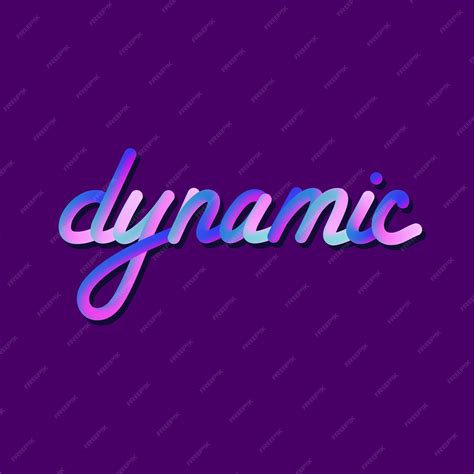
The artistic landscape of digital illustration is constantly evolving, and a prominent trend that has captured the attention of many is the captivating effect of gradient fills within lettering. This technique, which seamlessly blends one color into another, has become a staple for adding depth, dimension, and a unique visual flair to typography and artwork. This tutorial aims to demystify the process of creating and utilizing gradient brushes in Procreate, offering a step-by-step guide that caters to both beginners and experienced digital artists.
Understanding the Essence of Gradients
Before diving into the practical application, it's crucial to grasp what a color gradient truly is. A color gradient, at its core, is the smooth transition or blending from one color to another. This transition can be linear, radial, or even more complex, creating subtle shifts in hue, saturation, and brightness. In Procreate, gradients can be achieved through various methods, from utilizing built-in tools like Gaussian Blur and selection features to employing specialized brushes. The versatility of gradients allows them to be applied not just to lettering but also to backgrounds, shapes, and entire illustrations, enriching the visual narrative.
Preparing Your Canvas and Lettering Foundation
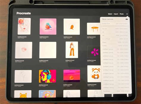
To begin your gradient lettering journey, the first step involves setting up your Procreate canvas and sketching out your desired text.
Sketching the Letterforms
The process starts with a rough sketch of your lettering. You can choose to replicate the example word and style provided or select your own. For those who prefer structured guidance, Procreate offers the flexibility to use custom guidelines. You might find it beneficial to download free guide brushes or create your own. For instance, a 'Square Grid' brush can be instrumental in maintaining consistent letter sizing.
To establish this foundational layer, create a new layer and select a light blue hue for your sketching color. Position this sketch layer above your grid layer if you are using one. Using the grid as a visual aid, carefully sketch the basic structure of your lettering. Perfection at this stage is not the primary goal; the focus is on establishing the general form and spacing. Ensure adequate space between letters to accommodate the stroke width that will define their final shape.
Refining the Letterform Outline
Once the initial skeleton of your lettering is in place, the next step involves expanding upon this sketch to create the definitive form of each letter. This is achieved by drawing an outline around your sketched letterforms. This refining stage can be repeated as many times as necessary until you are completely satisfied with the shape and flow of your lettering.
Adding Embellishments (Optional)
As an optional, yet highly effective, addition, you can introduce decorative elements to your letterforms. This might include adding dots, drips, or other stylistic flourishes that emanate from the letters. These embellishments can serve to break up the solid form of the text, creating visual interest and conveying a sense of movement or interaction, such as the impression of text dripping or reacting to light.
Crafting the Gradient: Multiple Approaches
With your lettering structure finalized, it's time to focus on creating the gradient that will bring your text to life. Procreate offers several effective methods for achieving this.
Method 1: Using Gaussian Blur for Smooth Transitions
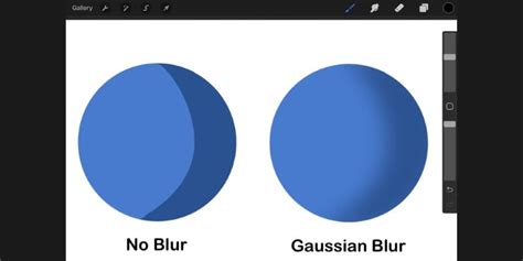
The Gaussian Blur effect is an invaluable tool for creating smooth and seamless gradients within Procreate. This method is particularly effective for achieving a polished and professional look.
Step 1: Fill Layer with Initial ColorBegin by opening the Procreate color palette and selecting your first color. Fill an entire layer with this chosen color. This will serve as the base for your gradient.
Step 2: Introduce a Second ColorCreate a new layer directly above your initial color layer. Select your second, complementary color and fill approximately half of this new layer with it. The precise proportion isn't critical at this stage, as the blur effect will blend the colors.
Step 3: Apply Gaussian BlurNavigate to the Adjustments menu (the magic wand icon) and select 'Gaussian Blur.' Crucially, ensure that 'Layer' is selected within the Gaussian Blur options. This ensures the blur is applied to the entire active layer.
Step 4: Adjust the Blur IntensityWith Gaussian Blur active, use your Apple Pencil or finger to slide across the screen. Sliding left will decrease the blur intensity, while sliding right will increase it. Adjust this parameter until you achieve the desired level of blending between your two colors. Experiment with different blur values to see how they affect the gradient.
Step 5: Merge for a Single Gradient LayerOnce you are satisfied with the blend, pinch two fingers together on the two color layers. This action merges them into a single layer, creating a cohesive gradient. You can extend this method to incorporate more than two colors by adding additional layers with different hues before applying the Gaussian Blur.
This Gaussian Blur technique can be applied to various shapes and not just linear fills. For instance, you can create stunning radial gradients within circles or other defined forms.
Method 2: Utilizing the Soft Brush for Organic Gradients
For gradients that follow the natural curves of your artwork or for a more organic feel, the Soft Brush can be an excellent choice.
Step 1: Establish the Base ColorAs with the previous method, start by filling a layer with your base color. Then, select your second color.
Step 2: Select and Prepare the Soft BrushOpen the Brush Library, navigate to the 'Airbrushing' category, and select the 'Soft Brush.' Adjust the brush size to be relatively large, allowing for broader strokes.
Step 3: Draw the GradientZoom out on your canvas to get a better overview. Starting with your brush off the canvas, slowly draw across the canvas with your chosen color. Continue to add strokes with different colors, layering them to create the gradient effect. This method allows the gradient to naturally follow any drawn curves.
Step 4: Refine with Gaussian Blur or Smudge Tool (Optional)If the blending isn't as smooth as you'd like, you can apply a small amount of Gaussian Blur to the gradient layer or utilize the 'Smudge Tool' to further refine the transitions. Remember to merge your color layers into a single gradient layer before proceeding.
Method 3: Leveraging the Selection Tool's Feathering Option
The 'Feather' option within Procreate's Selection Tool is designed to create soft, blurred edges, which can also be ingeniously used to generate gradients.
Step 1: Initial Color FillFill a layer with your first color. Then, select your second color.
Step 2: Activate the Selection ToolTap the Selection button in the top menu.
Step 3: Enable Color FillIn the Selection toolbar that appears at the bottom of the screen, tap 'Color Fill' to enable this mode.
Step 4: Draw Your SelectionChoose a Selection mode (e.g., Freehand) and draw the shape of your desired selection. If using Freehand, remember to tap the grey circle node to close the selection.
Step 5: Apply FeatheringNext, tap 'Feather' in the Selection toolbar. Adjust the feathering radius by sliding your finger or stylus. A higher feather value will create a softer, more blended edge, resulting in a gradient effect. Once you're satisfied with the feathering, tap the Selection button again to commit the changes.
This method is particularly useful for creating gradients within specific shapes or for achieving a subtle color transition along an edge.
Applying the Gradient to Your Lettering
Once you have created your gradient, the next crucial step is to apply it to your lettering design.
Clipping the Gradient to Letterforms
To ensure your gradient perfectly fills your lettering without spilling over, Procreate's clipping mask feature is essential.
Step 1: Create a New Layer for the GradientCreate a new layer that will house your gradient. Position this layer directly below your lettering reference layer.
Step 2: Place the Gradient LayerDraw or fill your gradient onto this new layer. Ensure that the gradient covers the area where your lettering will be.
Step 3: Clip the Gradient LayerTap on the gradient layer in the Layers panel. From the menu that appears, select 'Clipping Mask.' This will "clip" the gradient to the shape of the layer directly above it, which is your lettering sketch. Now, the gradient will only be visible within the boundaries of your lettering.
Masking for Precise Application
An alternative and highly effective method for applying the gradient involves using a mask.
Step 1: Prepare Gradient LayersCreate and arrange your gradient layers as described previously.
Step 2: Create a Lettering Reference LayerOn a new layer above your gradient layers, sketch out your lettering. Ensure this reference layer is nicely centered on your canvas. You can shift this layer as needed.
Step 3: Create a Black Mask LayerCreate a new layer above your lettering reference layer and fill it entirely with black. This black layer will act as your mask.
Step 4: Erase the Gradient ShapeWith the black layer active, select the Eraser tool instead of a brush. Begin by carefully erasing an outline of your letterforms from the black layer. As you erase, the gradient from the layers below will begin to show through in the shape of your lettering.
Step 5: Refine and FinalizeOnce you have established the basic shape of your lettering by erasing, you can turn off the visibility of your lettering reference layer for a clearer view of the gradient fill. You can then continue to refine the erased areas with the eraser or use a brush to fill in any gaps or adjust the edges. This method provides exceptional control over the placement and appearance of the gradient within your text.
How to Use Alpha Lock, Clipping Mask & Layer Mask in Procreate - Procreate Tips
Recolor Your Gradients with Gradient Maps
What if you're not entirely satisfied with the colors you've chosen for your gradient? Procreate's 'Gradient Map' feature offers a powerful solution for recoloring not only gradients but also entire illustrations. This feature analyzes the tonal values of your artworkâhighlights, shadows, and midtonesâand allows you to remap them to new colors.
Step 1: Activate Gradient MapTap the Adjustments button (magic wand icon) and select 'Gradient Map.' Choose 'Layer' to apply it to the active layer.
Step 2: Explore the Gradient LibraryThe Gradient Map interface presents a library of pre-set gradient palettes. You can select one of these or create your own custom gradients. Tapping and holding a palette allows you to duplicate or delete it. Tapping a palette or the '+' icon opens the Gradient Map editor.
Step 3: Customize Your GradientWithin the editor, you can rename your gradient palette. The color boxes along the gradient bar represent different tonal values. The left side of the bar influences the darker areas of your layer, while the right side affects the lighter areas. You can change the colors in these boxes, slide them to adjust their influence, or add more color stops for intricate blends. Tapping and holding a color box allows you to delete it. Once you've fine-tuned your desired color mapping, tap the Adjustments button to apply the changes.
Advanced Techniques and Tips
To further enhance your gradient creations in Procreate, consider these advanced tips:
Using Stamp Brushes for Texture
Incorporating stamp brushes can add unique textures to your gradients. For instance, using stamp brushes from sets like the '32 Mystic Procreate Stamps' can introduce interesting patterns or organic elements that interact with your color blends.
Installing Procreate Brushes
If you've downloaded custom brushes or textures, ensure you know how to install them in Procreate. A clear understanding of brush installation will expand your toolkit considerably.
Experimenting with Color Palettes
The choice of colors is paramount in gradient design. Experiment with complementary colors, analogous colors, or triadic color schemes to achieve different moods and visual impacts. Tools like Adobe Color or Coolors can be invaluable for generating harmonious color palettes.
Layer Management is Key
Effective layer management is crucial for complex Procreate projects. Grouping related layers, naming them clearly, and utilizing clipping masks and layer masks will keep your workflow organized and prevent errors.
Understanding Brush Settings
Delve into the settings of your brushes. Adjusting parameters like flow, jitter, and texture can dramatically alter how a brush applies color and how your gradients behave. The 'Soft Brush,' for example, has specific settings that contribute to its smooth blending capabilities.
The Power of Freehand Drawing
While tools and filters are incredibly useful, don't underestimate the power of freehand drawing. For artists who are comfortable with a stylus, drawing the gradient strokes directly can offer a level of control and expressiveness that automated methods might not always capture.
The Impact and Versatility of Gradients
Gradients are more than just a visual trend; they are a powerful design element that can significantly elevate your artwork. They can be used to:
- Add Depth and Dimension: Gradients create a sense of three-dimensionality, making flat designs appear more dynamic and engaging.
- Enhance Visual Interest: The smooth transitions of color draw the viewer's eye and add a sophisticated aesthetic.
- Convey Mood and Atmosphere: Color choices within a gradient can evoke specific emotions, from vibrant and energetic to calm and serene.
- Create Realistic Lighting Effects: Gradients can simulate how light falls on objects, adding a layer of realism to illustrations.
- Define Shapes and Forms: By subtly changing color, gradients can help define the contours and volume of shapes.
Whether you're creating eye-catching lettering, designing captivating backgrounds, or adding subtle nuances to character art, mastering gradient techniques in Procreate will undoubtedly expand your creative possibilities. The ability to blend colors seamlessly is a fundamental skill that, when combined with the powerful tools within Procreate, can lead to truly stunning visual results.