The conversion of specific spot colors, like PANTONE Reflex Blue C, into the four-color process (CMYK) spectrum presents a persistent challenge for designers and printers alike. While digital tools offer approximations, achieving a truly accurate representation requires a deep understanding of color theory, printing processes, and the inherent limitations of each color model. This guide delves into the complexities of transforming PANTONE Reflex Blue C into its CMYK equivalent, offering insights and practical considerations for achieving the best possible results.
Understanding the Fundamentals: Spot vs. Process Colors
At the heart of this conversion lies a fundamental difference between two primary color systems: PANTONE Spot Colors and CMYK Process Colors. PANTONE, often referred to as the Pantone Matching System (PMS), is not a color system in the traditional sense but rather a proprietary collection of specific, pre-mixed inks. Each PANTONE color is formulated with exact percentages of base inks to achieve a precise hue, ensuring consistency across different print runs and locations. This meticulous formulation is what makes PANTONE a reliable standard for brand colors and critical design elements where exact color fidelity is paramount.
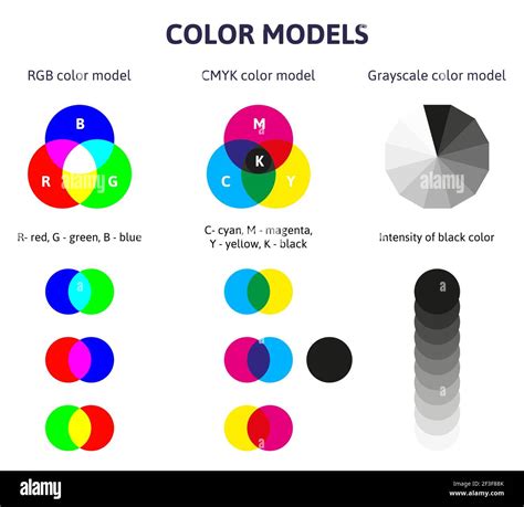
In contrast, CMYK (Cyan, Magenta, Yellow, and Key/Black) represents a four-color process printing method. This system builds colors by applying a series of tiny, overlapping dots of these four ink colors. The human eye perceives these dot patterns as a single, blended hue. This subtractive color model works by absorbing certain wavelengths of light and reflecting others. While CMYK offers a vast spectrum of reproducible colors and is cost-effective for full-color printing, it inherently has limitations. The mixing of inks in process printing can sometimes lead to less vibrant or "murkier" results compared to the purity of a spot color. Furthermore, not all colors achievable with PANTONE spot inks can be accurately replicated using only CMYK inks.
The Digital Disconnect: Screen vs. Print
A significant hurdle in color conversion is the discrepancy between how colors are displayed on digital screens and how they are reproduced on printed materials. Computer monitors and digital cameras operate on the RGB (Red, Green, Blue) additive color model. In RGB, colors are created by emitting light, with black being the absence of light and white being the combination of all primary light colors. This system allows for a broad range of luminous and vibrant colors.
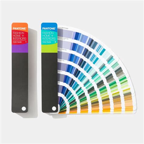
However, the critical point to understand is that a computer monitor can create colors that are simply impossible to reproduce in print using the CMYK process. Therefore, any digital representation of a PANTONE color, including those viewed on a screen, should be treated as a reference only. Relying solely on the visual impression of a color on a digital display is a significant risk. To truly ascertain the intended color, particularly for critical brand elements or print projects, purchasing a physical PMS color fan is highly recommended. This tangible tool provides an accurate representation of the spot color as it would appear in print, eliminating the guesswork associated with screen-based color perception.
Converting PANTONE Reflex Blue C to CMYK: The Practicalities
When the objective is to represent PANTONE Reflex Blue C using the CMYK color standard, the goal is to find the combination of Cyan, Magenta, Yellow, and Black inks that most closely approximates the original spot color. This process is not always straightforward, and various conversion tools and tables can yield slightly different results.
Our analysis, based on computational methods and an understanding of color reproduction, suggests that for PANTONE Reflex Blue C, the following CMYK values yield the most accurate representation for the human eye:
- Cyan: 100%
- Magenta: 75%
- Yellow: 0%
- Key (Black): 41%
These values aim to capture the depth and specific shade of Reflex Blue C within the constraints of the CMYK printing process. It's important to recognize that this is an approximation, and subtle differences may still exist.
Factors Influencing Conversion Accuracy
Several factors can influence the perceived accuracy of a PANTONE to CMYK conversion:
- Color Management Tools: Different software applications and digital printing devices come with their own color management tools. The quality and calibration of these tools can significantly impact the conversion outcome. Some tools may offer more sophisticated algorithms for approximating spot colors.
- Printing Press Calibration: The physical printing press itself plays a crucial role. The calibration of the press, the quality of the inks used, and the type of paper stock all contribute to the final printed appearance of the CMYK colors. Even with the "correct" CMYK values, variations in the printing environment can lead to different results.
- Substrate: The material on which the ink is printed (paper, cardstock, plastic, etc.) will affect how the colors appear. A glossy paper will reflect light differently than a matte paper, altering the perceived vibrancy and hue.
- Ink Density and Dot Gain: In CMYK printing, the density of the ink dots and how much they spread or "gain" on the paper (dot gain) are critical. These physical properties of ink and paper interaction can subtly shift the final color.
- Human Perception: Ultimately, color perception is subjective. What one individual perceives as a close match, another might see as slightly off. This is where a physical PMS color fan becomes invaluable, providing a standardized benchmark.
The Importance of Context: When is CMYK Conversion Necessary?
The necessity of converting PANTONE colors to CMYK arises primarily when a project is intended for four-color process printing. If a design specifies a PANTONE color but will be printed using only Cyan, Magenta, Yellow, and Black inks, then a conversion is essential. Without it, the printer would either have to attempt to mix an approximation of the spot color using process inks (which can be unreliable) or print the spot color separately, which is often not feasible for cost or complexity reasons if the job is intended as a 4c job.
Many graphic design applications, such as Adobe InDesign, Illustrator, and Photoshop, allow users to specify colors by their PANTONE name or number. These applications often have built-in conversion capabilities. However, it is crucial to be aware that the conversions generated by these tools are often approximations and may require manual fine-tuning or verification against a physical swatch.
Beyond Reflex Blue C: Other PANTONE Considerations
While this guide focuses on PANTONE Reflex Blue C, the principles apply to all PANTONE to CMYK conversions. Other PANTONE colors, particularly those with high saturation or unique hues, can be notoriously difficult to reproduce accurately in CMYK. For instance, vibrant greens, oranges, and some blues might lose their intensity or shift in hue when converted.
The PANTONE system includes a vast library of colors, including various shades of blues, grays, and even blacks. For example, other PANTONE blues like PMS Blue 072 C, or even different shades of black like PMS Black 2 C through PMS Black 7 C, each have their own specific CMYK equivalents, and the accuracy of these conversions can vary.
Best Practices for PANTONE to CMYK Conversion
To ensure the best possible outcome when converting PANTONE colors to CMYK, consider the following best practices:
- Understand the Project's Printing Method: Confirm whether the final output will be four-color process (CMYK) or if spot color printing is an option. If spot color is viable and color accuracy is critical, it is often the preferred method.
- Utilize Physical Color Guides: Always refer to a physical PANTONE Color Bridge or Formula Guide for the most accurate representation of the spot color and its intended CMYK equivalent. Do not rely solely on digital displays.
- Use Reputable Conversion Tools: Employ color management tools within professional design software or specialized conversion utilities. Be aware that these are starting points, not definitive answers.
- Test Prints are Crucial: Before committing to a large print run, always conduct a test print. This allows for visual inspection of the converted colors on the actual paper stock and under typical printing conditions.
- Communicate with Your Printer: Maintain open communication with your print provider. They can offer valuable insights into their specific printing capabilities and recommend the most effective conversion strategies for their equipment.
- Consider Color Difference (Delta E): For critical applications, designers might consider using color measurement tools that calculate Delta E (ÎE), a metric for the difference between two colors. A lower Delta E value indicates a closer match. While a Delta E of 0 means an exact match, achieving this for complex spot-to-process conversions is often impossible. The acceptable Delta E threshold will depend on the project's requirements.
- Adjust as Needed: Be prepared to make manual adjustments to the CMYK values based on test prints and your printer's feedback. This iterative process is often necessary to achieve the desired result.
What Is The Difference Between RGB and CMYK? Color Models and Print
Beyond Hue: Other Color Metrics
While hue is the primary focus of conversion, other color metrics can be relevant. The Light Reflectance Value (LRV) measures how much visible light a color reflects, on a scale of 0 (pure black) to 100 (pure white). Understanding the LRV of a PANTONE color can provide additional context for its brightness and how it might perform in certain applications, especially concerning readability. For instance, ensuring sufficient contrast between text and background colors is vital for accessibility, as recommended by WCAG guidelines (e.g., large text should be above 18pt or 14pt bold).
Furthermore, when looking for similar or equivalent colors, one might encounter other PANTONE colors or even paint color matches from brands like Benjamin Moore, Valspar, or Sherwin Williams. While these can offer inspiration or alternative solutions, they are distinct from the direct CMYK conversion of PANTONE Reflex Blue C. Similarly, the concept of complementary colors, which are opposite each other on the color wheel and create strong contrast, is a fundamental aspect of color theory but not directly a conversion metric.
In conclusion, converting PANTONE Reflex Blue C to CMYK is a process that demands attention to detail, an understanding of color science, and a pragmatic approach to printing limitations. While digital tools provide a starting point, the ultimate success lies in careful calibration, thorough testing, and clear communication with your print partner, always prioritizing physical color references over digital displays.