Royal blue, a color that evokes a sense of regality, trust, and depth, is more than just a visually appealing hue. It's a shade with a rich history, specific color values that define its appearance across different mediums, and a multifaceted symbolism that influences its use in design, fashion, and beyond. While often associated with royalty and prestige, royal blue also carries connotations of reliability, stability, and even tranquility. Understanding its unique characteristics, particularly its CMYK values, is crucial for designers, printers, and anyone seeking to accurately reproduce this captivating color.
Defining Royal Blue: Hue, Saturation, and Lightness
Royal blue is characterized as a deep, vivid blue. It occupies a specific position on the color spectrum, often described as being between blue and violet. This rich color combines sophistication with a hint of purple undertone, projecting elegance and depth. It is important to distinguish royal blue from similar shades; it is lighter than navy blue, which is a darker shade. Furthermore, royal blue is a far more saturated version of blue.
The hexadecimal color code for royal blue is commonly cited as #4169e1. In the RGB color space, this translates to approximately 25.5% red, 41.2% green, and 88.2% blue. This composition highlights the dominance of blue in its creation.
The CMYK Composition of Royal Blue
When it comes to color printing, the CMYK (Cyan, Magenta, Yellow, and Key/Black) color model is fundamental. This subtractive color model is used in most commercial printing processes. For royal blue, the CMYK values provide a precise recipe for achieving the color using inks.
The CMYK values for royal blue, specifically for the hex code #4169e1, are approximately 71% cyan, 53% magenta, 0% yellow, and 12% black. This indicates that a significant amount of cyan and magenta ink is required, with a minimal amount of black and no yellow ink. It is important to understand that in practice, there is more than one way to mix pigments for royal blue color using a 4-color process. This is because CMYK colors don't really have a strict cross-reference chart with names attributed to each shade variation. Some CMYK colors are named by various manufacturers, and most CMYK color names that are passed around are designated by the general public.
Another closely related definition of royal blue, identified by the hex code #305CDE, shows slightly different CMYK values: 65% cyan, 65% magenta, 0% yellow, and 33% black. This variation underscores the nuanced nature of color reproduction and the slight differences that can arise depending on the specific definition or source of the color. These CMYK values represent the proportion of each ink that needs to be mixed to create the desired shade of royal blue.
A Historical Perspective: The Genesis of a Regal Hue
The name "royal blue" first appeared in historical records between 1810 and 1820. The "royal" designation in royal blue originates from England. Legend has it that the hue was created for a competition to design a dress for Queen Charlotte (1744-1818). This association with British royalty immediately imbued the color with a sense of prestige and significance.
However, the shade of blue associated with the name has not remained constant throughout history. Before the 1950s, royal blue was generally considered to be a much darker shade. The evolution of the color's perception continued into the late 1980s when the World Wide Web Consortium, the international group for web standards, officially matched a brighter version of this blue, along with its RGB code, to the name "royal blue." This standardization was pivotal for its consistent representation in the digital realm.
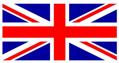
Lesser-known variations of royal blue include "Queen blue" and "Imperial blue." Queen blue is a medium-tone version, offering a more subdued effect, while Imperial blue describes a darker shade, closer to navy blue. In keeping with its strong association with British history, the color royal blue features prominently on the United Kingdom's flag, the Union Jack, further cementing its regal identity.
The Multifaceted Meaning of Royal Blue
The color royal blue carries a rich tapestry of meanings, deeply intertwined with its historical associations. Its connection to the British throne naturally imbues it with a sense of regality, authority, and prestige. This historical weight makes it a popular choice for formal wear, such as suits and bridesmaid dresses, as well as for branding that aims to convey a sense of established quality and trustworthiness.
According to color psychology, blue in general is associated with trustworthiness and reliability. This is often attributed to its calming presence, reminiscent of the vast sky and the deep ocean, both of which are known to promote feelings of tranquility and peace. However, it's worth noting that blue can also be associated with negative emotions, as seen in phrases like "feeling blue" or the musical genre "the blues." Royal blue, with its bright and vivid hue, is less likely to evoke these somber impressions. Instead, its intensity often conveys confidence and stability.
Royal blue embodies royalty, luxury, and sophistication. Its historical association with authority and elegance extends to ancient beliefs, where it was used in amulets and garments, signifying safety and protection. It even carries spiritual connotations of divinity, wisdom, and joy. In color psychology, royal blue connects deeply with trust and reliability. Its richness implies stability and confidence, while its ties to the sky and sea bring calmness and tranquility. Royal blue's UI/UX design versatility allows it to express power, authority, peace, or trustworthiness, building user confidence through the color’s association with credibility and professionalism, making it a strong choice for finance and healthcare interfaces.
Practical Applications: Using Royal Blue in Design and Fashion
Royal blue's versatility makes it a highly adaptable color for a wide range of applications. In branding, its common use for business logos stems from blue's inherent associations with trust and reliability, making it a solid choice for companies aiming to project stability and credibility.

In graphic and web design, royal blue can be employed in several strategic ways. Its vibrancy makes it ideal for commanding attention, making it suitable for call-to-action buttons, prominent links, logos, or navigation elements. It can also be used to build trust, reinforcing reliability, which is particularly beneficial for brands in the finance, healthcare, and technology sectors. Furthermore, royal blue can be used to evoke a specific emotion and atmosphere. Its depth and richness can be leveraged in backgrounds or gradients on splash screens and landing pages to create a sense of depth, stability, and sophistication. For data visualization, royal blue's clarity and visual appeal make it excellent for charts, graphs, and progress bars, helping to differentiate and highlight important information.
In fashion, royal blue offers a tasteful pop of color and has the advantage of suiting a wide range of skin tones. It can be used as an accent color to add vibrancy to a more subdued color scheme, or, for a more dramatic effect, it can be paired with other bright colors.
In interior design, royal blue's intensity can be effectively balanced with neutral tones such as ivory or champagne, creating a sophisticated and elegant space.
Color Pairings: What Goes Well with Royal Blue?
Royal blue is an eye-catching and versatile color, but its bright hue means it needs careful consideration when pairing with other colors to avoid creating too much intensity or visual discord.
Colors that pair well with royal blue include:
- Gold: This pairing enriches the royal palette with its luxury, emphasizing the luxuriousness of royal blue.
- Ivory: Ivory provides a soft, warm contrast, offering a classic elegance that beautifully highlights the depth of royal blue.
- Charcoal Gray: This introduces a modern, sophisticated contrast, grounding the vibrancy of royal blue with its neutral stability.
- Yellow: A classic complementary color on the color wheel, yellow creates a vibrant and energetic contrast.
- Off-white or Ivory: Similar to ivory, off-white offers a soft, neutral counterpoint.
- Green: Depending on the shade of green, this can create harmonious or contrasting combinations. Pastel green, for instance, offers a refreshing and uplifting contrast that emphasizes royal blue's richness with a touch of spring freshness.
- Hot Pink: While potentially bold, hot pink can create a vibrant and playful contrast.
- Gray: Various shades of gray can provide a sophisticated backdrop or a subtle contrast.
Other colors worth considering include deep red for a bold, impactful statement, silver for a sleek, contemporary vibe, and light gray for a soft, muted contrast that allows royal blue to shine.
Colors that may clash with royal blue include:
- Kelly Green: This can be too bright and may overpower the sophistication of royal blue, leading to a visually jarring combination.
- Orange: While orange is the complementary color on the color wheel, a pure, bright orange can present a stark, vibrant contrast that may detract from royal blue's regal essence, making the palette feel overly aggressive.
- Hot Pink: While playful, hot pink may compete too strongly with royal blue, potentially clashing and overshadowing its majestic quality.
- Neon Yellow: This has a striking luminosity that could overwhelm and diminish the deep elegance of royal blue.
- Dark Brown: Though neutral, dark brown might be too earthy and could dull the vibrant, royal essence of the blue, leading to a less harmonious pairing.
Similar Colors to Royal Blue
For those seeking variations within the same vibrant and regal spectrum as royal blue, several related hues offer subtle yet distinct characteristics:
- Cobalt Blue (#0047AB): Possesses a slightly deeper hue with an intense depth reminiscent of the striking appeal of royal blue.
- Sapphire Blue (#0F52BA): Offers a gemstone-inspired richness, balancing brightness and depth that mirrors royal blue's allure.
- Dodger Blue (#1E90FF): This is lighter and more luminous, capturing the spirited vibrancy characteristic of royal blue.
- Persian Blue (#1C39BB): Blends the deep majesty of royal blue with a hint of purple, adding a touch of exotic elegance.
- Blue Grey: A softer, more muted variation that still retains a blue base.
- Navy Blue: A significantly darker shade, often considered a more subdued and formal counterpart.
- Dark Blue: A general term that can encompass shades deeper than royal blue.
- Misty Blue: A lighter, more desaturated version of blue, offering a gentler feel.
🔸 The ONLY Colour Theory Video You Ever Need To Watch!
Understanding Color Variations: Shades, Tints, and Tones
To further refine the use of royal blue, it's helpful to understand how variations in hue are created:
- Shades: Achieved by adding black to any pure hue, creating darker versions.
- Tints: Created by mixing white with any pure color, resulting in lighter versions.
- Tones: Produced by adding gray to any pure hue, leading to more muted or subdued versions.
These variations allow for a broad spectrum of blues to be derived from the core concept of royal blue, offering flexibility in design and application.
Conclusion
Royal blue is a color of profound depth, historical significance, and versatile application. From its origins linked to English royalty to its modern-day use in digital interfaces and fashion, it consistently conveys a sense of trust, sophistication, and stability. Understanding its specific CMYK values is essential for accurate reproduction, ensuring that its regal essence is captured faithfully across all mediums. Whether used as a primary color or an accent, royal blue continues to be a powerful choice for designers and creators seeking to evoke a sense of prestige and reliability.