Lightroom CC, a powerful tool for photographers, offers a crucial feature for ensuring your digital images translate faithfully to print: soft proofing. This capability allows you to preview on-screen how your photos will appear when printed on a specific device, enabling you to optimize them for a particular output. Understanding and utilizing soft proofing can significantly elevate the quality of your printed work, bridging the gap between your on-screen vision and the tangible final product.
The Foundation: Process Versions and Color Management
Before diving into soft proofing, it's essential to grasp the underlying technologies that influence how Lightroom Classic handles image adjustments and color. The Process Version is the core technology that Lightroom Classic employs to adjust and render photos in the Develop module. Accessing this is done via Settings > Process.
Currently, Process version 5 offers enhanced negative dehaze capabilities and improved image quality for high-ISO RAW files. For images edited for the first time in Lightroom 4 and later, process version 2012 (PV2012) is the default. PV2012 introduced new tone controls and sophisticated tone-mapping algorithms, particularly beneficial for high-contrast images. Within the Basic panel of PV2012, you can precisely adjust Highlights, Shadows, Whites, Blacks, Exposure, and Contrast. Images edited in Lightroom 3, by default, utilized PV2010.
Understanding these process versions is vital because they dictate the range and nature of adjustments possible. However, the true magic of achieving accurate prints lies in color management, and soft proofing is a key component of this.
A profile is essentially a mathematical description of a device's color space. By default, the Lightroom Classic Develop module displays images using your monitor's profile, aiming to accurately represent colors as your screen can produce them. Soft proofing, however, allows you to simulate how those colors will appear when converted from your monitor's color space to another, such as that of a specific printer and paper combination.
Perceptual rendering intent is often suitable for images with many saturated, out-of-gamut colors. It aims to preserve the overall visual relationship of colors by compressing the entire color space, ensuring that even colors that cannot be perfectly reproduced still maintain their relative relationships.
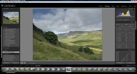
The Mechanics of Soft Proofing in Lightroom Classic
Soft proofing is the capability to preview on-screen how photos appear when printed, and to optimize them for a particular output device. This is achieved through the Soft Proofing box found in the toolbar.
When you intend to edit your photo to bring it within a desired color space for printing, the recommended workflow is to click Create Proof Copy. Lightroom Classic then generates a virtual copy of your image, allowing you to make adjustments specifically for that print output without altering your original file. If you begin making adjustments without first creating a proof copy, Lightroom Classic will prompt you, asking if you wish to create a virtual copy for soft proofing. Choosing "Create Proof Copy" is crucial for preserving your original image and working on a dedicated copy. Alternatively, you can select "Make This A Proof" to edit the original image directly, though this is generally less recommended for preserving your master file. It's important to remember that all editing in Lightroom Classic is non-destructive. As you make adjustments in the Develop module or the Quick Develop panel of the Library module, Lightroom Classic meticulously records these settings.
Copying and Pasting Settings: Efficiency in Workflow
Streamlining your editing process is also facilitated by Lightroom Classic's ability to copy and paste settings. To copy settings, navigate to Settings > Copy Settings or Develop Settings > Copy Settings. Select the desired settings and click "Copy." In the Library module, this function also copies text and metadata. To paste these settings onto other photos, use the Paste Settings command under Develop Settings > Paste Settings.
For applying edits to a batch of photos, select all the desired images in the filmstrip. Then, toggle the Sync switch to activate the Auto Sync button.
The Match Total Exposures command, available in both the Library and Develop modules, is invaluable for making a series of photos with varying exposure values appear more consistently exposed. This command allows you to match the exposure of the current photo to other photos in the Filmstrip, though it's not available in all contexts.
In the Develop module, you can synchronize settings by clicking the Sync button or choosing Settings > Sync Settings. To enable Auto Sync mode, click the Enable Auto Sync switch on the left side of the Sync button. Similarly, in the Library module, you can synchronize settings via the Sync Settings button or by selecting Photo > Develop Settings > Sync Settings.
When working in Reference View, select a reference photo. Then, select all the photos in the Filmstrip to which you wish to apply the develop adjustments. At the lower-right corner of the screen, activate Auto Sync mode by clicking the Enable Auto Sync switch on the left side of the Sync button. You can then make adjustments to the Active photo to visually match the characteristics of the Reference photo. When multiple photos are selected in the Filmstrip, the "Previous" button in the Develop module conveniently transforms into the "Sync" button.
Snapshots and History: Preserving Your Creative Journey
Lightroom Classic allows you to save any state of a photo as a snapshot. These snapshots are then listed alphabetically in the Snapshots panel, providing a way to bookmark specific editing stages. The History panel meticulously records the date and time a photo was imported into Lightroom Classic, along with any preset applied at that moment. Subsequently, every adjustment made to a photo is saved as a distinct state and listed chronologically in the History panel. When the History panel becomes excessively long, creating snapshots of the states you wish to preserve is highly recommended. You can then clear the panel by clicking the Clear All button.
To enhance Lightroom's performance while editing photos in the Develop module, a preference option allows you to edit Smart Previews even when Originals are available. While this might temporarily display a decreased quality of the photo during editing, the final output will always remain at its full size and quality. After enabling this preference, remember to restart Lightroom Classic for the changes to take effect.
The Nuances of Color: Monitors, Profiles, and Perception
The journey to accurate prints often involves a deeper understanding of color reproduction, and this is where the complexities of monitors, color spaces, and human perception come into play.
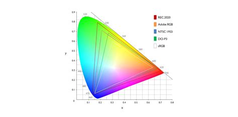
An incorrectly calibrated monitor is frequently cited as the primary reason for poor prints. The printers, paper, and calibration equipment used in professional workflows are critical. The standard for high-quality displays has evolved significantly. State-of-the-art monitors typically feature IPS panels with high nit brightness (e.g., 1000 nits), HDR-10 support, and wide color gamut coverage such as 98% DCI-P3, 99.5% Adobe RGB, and 100% sRGB/Rec. 709.
However, possessing a high-end monitor is only the first step. Color correction using a colorimeter (such as a Spyder X2 or I1DisplayPro) is crucial. It's futile to create an image with a "true red" (e.g., Hex FF0000) if your monitor is incapable of displaying that color accurately. Only with a color-corrected display can you expect to achieve your desired results.
Even with calibrated displays, individual color perception varies. Amplifying this issue, even two identical side-by-side displays calibrated with the same colorimeter and displaying the same image using the same software can exhibit color differences due to individual viewer perception.
The next critical consideration is whether the application displaying the image is color-managed. This means that if an image has an embedded ICC color profile, the application must honor that profile. Today, most Windows and Mac browsers offer some degree of color management; Microsoft Edge is color-managed, while Internet Explorer is not. Mobile devices often lack robust color management.
Assuming you have corrected the color for your image to your satisfaction in Lightroom and are content with its appearance in a color-managed browser, you are still at the mercy of the end-user's viewing environment. Their application may or may not be color-managed, and their display is likely uncalibrated, with even less likelihood of having the same color characteristics as your own monitor.
Soft Proofing: Bridging the Transmissive and Reflective Worlds
Soft proofing is specifically for printers and paper. Displays show transmitted colors, meaning colors are seen as light emitted from the screen. A paper print, on the other hand, shows reflected colors, where light is reflected off the surface. Soft proofing attempts to emulate the reflectance characteristics of a specific paper and printer using the transmissive characteristics of a monitor.
It's important to note that RAW photo file values have no inherent color or color space. The Adobe RGB setting in a camera is typically for JPEGs. If you set the camera to shoot RAW and sRGB (for JPEGs), the color space is assigned when the RAW file is converted to RGB. For Lightroom Classic, the working color space is ProPhoto RGB.
A common scenario that highlights the need for soft proofing arises when clients complain about washed-out colors or lost detail in vibrant areas when receiving sRGB images, despite them appearing perfectly fine prior to export (without soft proofing) in Lightroom. This often occurs because the sRGB color space has a smaller gamut than wider color spaces like Adobe RGB or ProPhoto RGB, meaning some colors, particularly vibrant reds and magentas, simply cannot be represented within sRGB.
Color Management, Color spaces and Gamut
The sRGB Challenge: Maximizing Reds and Magentas
Within the limitations of sRGB, there are indeed tricks to get the absolute most out of what's possible, especially regarding reds and magentas. When an image is exported to sRGB, colors that fall outside the sRGB gamut are mapped to the nearest reproducible color on the edge of the sRGB triangle. This mapping can lead to a loss of saturation and detail in those out-of-gamut areas.
When soft proofing to sRGB, you can observe these shifts. While you might not be able to retain the original red saturation, you can often bring back detail and shift the colors in a direction that looks visually appealing within the sRGB constraints. Tools like the Point Color adjustment in Lightroom can be particularly useful here, allowing for targeted adjustments to specific color ranges.
The observation that soft-proofed images under the edit tab, the image preview in the Library, and exported images in sRGB appear similar is a key indicator. This suggests that the soft-proofing process, when set to an sRGB profile, is effectively simulating the sRGB output. This also implies that the standard Lightroom Develop tab preview, without soft proofing, is a less accurate representation of the final sRGB output.
For web use, where sRGB is ubiquitous, it's crucial to preview and adjust your images with an sRGB profile enabled in soft proofing. This allows you to anticipate and mitigate potential color shifts before exporting.
Practical Application: Setting Up and Using Soft Proofing
Setting up soft proofing in Lightroom Classic is straightforward, though it requires attention to detail.
- Enable Soft Proofing: In the Develop Module, locate the Soft Proofing checkbox at the bottom of the main image preview. Click it to toggle the mode on and off. If you don't see it, check the dropdown menu to the far right of the preview bar.
- Create a Proof Copy: Below the histogram, you'll find options for soft proofing. Click Create Proof Copy to duplicate your image. This creates a virtual copy specifically for your soft-proofing adjustments.
- Select the Profile: In the Profile dropdown, choose the relevant ICC profile for your printer and paper combination. This is the most critical step for accurate simulation. If you don't have a profile for your specific setup, you may need to obtain one from the paper manufacturer or have a custom profile created.
- Rendering Intent: Choose between Relative and Perceptual rendering intents. Relative preserves color accuracy and is suitable for images requiring precise color matching. Perceptual maintains the visual relationship of colors and is generally better for images with gradients and many saturated colors. It's advisable to try both to see which yields the best results for your image.
- Gamut Warnings: To the top left and right of the histogram, you'll find icons that, in soft-proofing mode, toggle gamut warnings.
- Monitor Gamut Warning: Highlights colors that exceed your monitor's displayable range.
- Destination Gamut Warning: Highlights colors that are outside the target color space (your printer profile).While gamut warnings can be informative, they can sometimes mask the effect of "Simulate Paper & Ink." Many users prefer to keep them off during the primary soft-proofing adjustments and only enable them for quick checks.
- Simulate Paper & Ink: This is a crucial option. Tick Simulate Paper & Ink to get a more accurate preview of how the ink will appear on the chosen paper, including the paper's inherent color and the ink's absorption characteristics. This option often makes the soft-proof look "worse" initially, as it accurately reflects the limitations of the printing process, but it's essential for making informed adjustments.
Common Pitfalls and Best Practices
- Uncalibrated Monitor: The most common mistake. Always use a calibrated monitor for accurate color representation. Devices like the Datacolor Spyder or Calibrite Display Plus HL are essential tools.
- Ignoring "Simulate Paper & Ink": This option is vital for understanding how your print will truly look. Don't be discouraged if the preview appears less vibrant; it's a realistic simulation.
- Over-adjustment: When correcting for out-of-gamut colors, it's possible to push adjustments too far, negatively impacting the image's overall impact and saturation.
- Assuming Soft Proofing is the Final Word: While incredibly useful, soft proofing is a simulation. The ultimate test remains a physical print. Making small test prints on your intended paper is the most reliable way to assess the final outcome.
- Understanding the Limitations: Soft proofing cannot magically create colors that a device cannot reproduce. It allows you to manage and adapt colors within the available gamut.
The Future of Soft Proofing and Color Management
As display technology advances, with wider gamuts and HDR capabilities becoming more prevalent, the role of soft proofing continues to evolve. While its primary application has historically been for print, its utility for previewing images in different screen color spaces, such as sRGB for web, is increasingly recognized. The lack of extensive tutorials on soft proofing for transmissive media might stem from the historical focus on print and the fact that color management features in software like Lightroom have seen minimal substantial changes over many years. However, with the proliferation of wide-gamut displays and new video standards, the demand for such guidance is growing.
Ultimately, photography is often about the print. Soft proofing in Lightroom Classic is an indispensable tool for bridging the gap between your digital vision and the tactile reality of a well-executed print. By understanding its mechanics, embracing color management principles, and practicing diligently, you can significantly improve the accuracy and impact of your printed photographs.