Placing text along a curved path is a fundamental design technique that can elevate the aesthetic appeal and communicative power of your graphics. Whether you're designing a logo, a vintage-style poster, or an intricate illustration, the ability to precisely position and manipulate text on a curve opens up a world of creative possibilities. This guide will delve into the intricacies of text wrapping on curves, covering the essential steps from creation to fine-tuning and removal, ensuring a thorough understanding for users of varying skill levels.
The Foundation: Text and Path
Before any text can be gracefully laid upon a curve, two essential components must be in place: a line of text and a path. The text itself must be a single line; multi-line text cannot be directly applied to a curve in this manner. The path, on the other hand, offers more flexibility. While the concept revolves around curves, a straight line can also serve as a valid path, allowing for text to be aligned along a linear element. The key is that the path acts as a guide, dictating the shape and flow of the text.
The "Text on a Curve" Tool: Bringing Text to Life
The core functionality for achieving text on a curve lies within a dedicated tool, often labeled "Text on a Curve." To initiate the process, you must first select your text object. Subsequently, while holding down the shift key, you select the path object that will serve as the foundation for your text's curvature. This selection process is crucial, as it tells the software which text should be applied to which path.
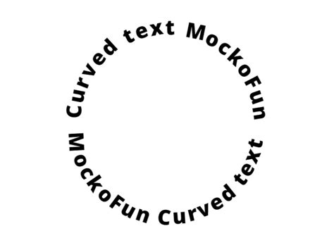
Once both the text and the path are selected, activating the "Text on a Curve" tool initiates the transformation. Generally, the tool tends to place the text on the side of the path opposite to its starting point. Understanding the starting point of your path is key here. In the context of a circle, for instance, the starting point is often indicated by a specific node (like a green node when in node editing mode). This initial placement might not always be exactly where you envision your text, but it serves as a starting point for further refinement.
Fitting Text to a Path in PaintShop Pro
Precision Placement: Manipulating Text on the Curve
The true power of the "Text on a Curve" functionality lies in its granular control over the text's position and orientation. After the text has been applied to the curve, a small, often blue, handle will appear underneath the text. This handle is your primary tool for repositioning. By clicking and dragging this handle, you can move the text freely along the entire length of the curve. The software is typically designed to "snap" the text to key points on the path, such as the center of a circle or the endpoints of a line, making precise alignment straightforward.
This ability to drag the text allows you to achieve perfect centering, distribute it evenly, or place it at any specific location along the curve that best suits your design. Furthermore, the tool often provides an option to "flip" the text to the opposite side of the curve. This is invaluable for situations where the initial placement is on the inside of a curve, but you require it to be on the outside, or vice-versa. This flipping mechanism ensures that you have complete control over the text's orientation relative to the path.
Fine-Tuning: Spacing, Alignment, and Offset
Beyond simple placement, advanced options allow for meticulous fine-tuning of the text's appearance on the curve. You can often adjust the "offset distance," which controls how far the text is positioned perpendicularly from the curve itself. This is useful for creating subtle depth or ensuring legibility, especially when dealing with complex background elements.
The "alignment" settings offer further control over how the text is positioned relative to the path's anchor points or segments. This can range from aligning the text to the start, end, or center of a curve segment.
Perhaps one of the most critical aspects of text on a curve is managing the "spacing" between characters. When text follows a curved path, the natural spacing between letters can appear distorted due to the varying distances from the curve's center. The spacing options within the "Text on a Curve" tool allow you to compensate for this. You can adjust the overall spacing between letters to prevent overlap, especially in tighter curves, or to create a more visually pleasing distribution. For even finer control, the text can often be manually edited with a text edit tool after it has been placed on the curve. This allows for micro-adjustments to individual letter spacing, ensuring perfect visual harmony.
Removing Text from a Curve: Reverting to Simplicity
Just as essential as placing text on a curve is knowing how to remove it when your design evolves or when you need to revert the text to its original, uncurved state. To detach text from its curved path, you typically select the text object itself. Once selected, a common action is to click a button or use a command that effectively "straightens" the text. This action detaches the text from the path, returning it to a standard, straight line of text.
It's important to note that after detaching the text, certain modifications, such as spacing adjustments made specifically for the curve, might still be applied to the text. You may need to reset or re-edit the spacing to achieve the desired look for the straightened text. In some software, a keyboard shortcut, like F9, might be available to center the straightened text within your document or artboard, offering a quick way to reorient it. Returning to a standard selection mode then brings you back to normal object manipulation.
Advanced Considerations and Creative Applications
The principles of text on a curve extend beyond basic graphic design. In fields like engineering and manufacturing, precise text placement on curved surfaces is crucial for labeling parts, instructions, or branding. The underlying concepts of path following and manipulation are universal, though the specific tools and precision levels may vary.
Understanding Path Directionality
The direction in which a path is drawn significantly influences how text will wrap around it. Most software interprets the path's directionality to determine the text's flow. If text appears to be flowing in the opposite direction than desired, reversing the path's direction can often resolve the issue. This is a common troubleshooting step when text doesn't wrap as expected.
Bézier Curves and Complex Shapes
Advanced users often work with Bézier curves, which offer unparalleled control over path creation. Text can be applied to these complex curves, allowing for highly customized and organic text layouts. The ability to manipulate control points and handles of Bézier curves directly impacts the shape of the text that follows.
Text as a Path
In a fascinating counterpoint, text itself can sometimes be converted into a path. This allows the outlines of the letters to be manipulated, stretched, or even used as a guide for other text. This technique is more advanced and is often used for highly stylized typographic effects.
Performance and File Size
Be aware that complex text-on-curve effects, especially with many individual characters and intricate paths, can sometimes impact software performance and increase file sizes. Optimizing paths and managing text elements efficiently is a good practice for larger projects.
Accessibility Considerations
While visually appealing, text on a curve can sometimes pose accessibility challenges for individuals using screen readers. It's important to consider how information conveyed by the curved text can also be accessed in a more straightforward, linear format for users with visual impairments. This might involve providing alternative text descriptions or ensuring the core message is also present in a standard text format elsewhere in the design.
Beyond the Basics: Creative Exploration
The "Text on a Curve" functionality is not just a tool for following instructions; it's a gateway to creative expression. Experiment with different fonts, path shapes, and spacing to discover unique typographic solutions. Consider how text can interact with other elements in your design, creating depth, emphasis, or a sense of movement.
For instance, you could create a circular logo where the company name elegantly curves around the emblem. Or, in a poster design, text could follow the contour of an illustration, enhancing the overall narrative. The possibilities are vast, limited only by imagination and the capabilities of your chosen design software.
The ability to precisely control text placement, alignment, and spacing on any given path, whether curved or straight, is a cornerstone of effective graphic design. By understanding the foundational elements, mastering the tools, and exploring advanced techniques, you can transform ordinary text into dynamic and engaging design components.