Achieving the authentic feel of watercolor paper within digital art is a pursuit that has captivated artists and designers alike. The subtle grain, the uneven absorbency, and the characteristic texture of watercolor paper lend a unique character to any artwork. Fortunately, Adobe Photoshop offers a powerful suite of tools that allow for the realistic simulation of these qualities, transforming a flat digital image into something with a tangible, physical presence. This guide will delve into various methods for creating and applying watercolor paper textures in Photoshop, from foundational techniques to advanced applications, ensuring your digital creations possess that sought-after artisanal touch.
Understanding the Essence of Watercolor Paper Texture
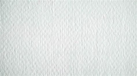
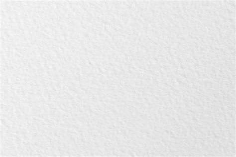
Before diving into Photoshop, it's crucial to understand what defines watercolor paper texture. Unlike smooth, conventional paper, watercolor paper is designed to withstand the application of water and pigment without buckling or disintegrating. This resilience is achieved through various manufacturing processes, often involving the use of a "mould-made" or "cylinder mould" process, which results in a characteristic surface. This surface can range from "hot-pressed" (smooth), "cold-pressed" (semi-rough, the most common), to "rough" (highly textured).
The texture manifests as a subtle, irregular pattern of raised and recessed areas. These variations affect how paint sits on the surface, creating blooms, lifting effects, and a distinct visual depth. When simulating this in Photoshop, the goal is to replicate these physical characteristics digitally, adding a sense of realism and tactility to otherwise flat pixels.
Overlaying Textures: The Direct Approach
One of the most straightforward methods to impart a watercolor paper texture is by overlaying a pre-existing texture image onto your artwork. This technique gives an image a physical quality, whether you’re aiming for a worn, grunge aesthetic or the specific, patterned appearance of a painter’s canvas.
Finding Your Texture:The first step is to acquire a suitable texture image. Resources like Adobe Stock offer a selection of free, high-resolution texture images that can serve as excellent starting points. Searching for terms like "watercolor paper texture," "paper texture," or "grunge paper" will yield numerous options. It's beneficial to look for images that are seamless if you plan to tile them, and that have a good range of tonal variation.
Applying the Texture in Photoshop:
Prepare Your Project: Open the Photoshop project you’d like to add your texture to, or start a new one by adding your primary image as a background layer. Ensure your background layer is unlocked and ready for manipulation.
Import the Texture: Drag and drop your chosen texture image into your Photoshop document. This will typically appear as a new layer. Position this layer above the background layer in the Layers panel.
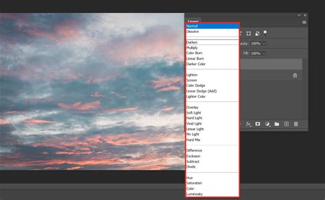
Adjusting the Texture Layer: Your texture layer may be hiding your background layer entirely at this point. This is expected and will be addressed by adjusting its blending mode.
Blending the Texture: Select the texture layer. Navigate to the Blending Modes drop-down menu in the Layers panel. Experiment with different modes to find the one that best integrates the texture with your underlying image. The "Overlay" blending mode is a popular choice, as it intensifies the colors and contrast of the underlying layers while allowing the texture's pattern to show through. Other effective modes to consider include "Soft Light," "Multiply," or "Screen," depending on the desired effect and the characteristics of both the texture and the base image.
Refining the Blend: Once a blending mode is selected, you can further refine the integration by adjusting the opacity of the texture layer. Lowering the opacity will make the texture more subtle, while keeping it higher will result in a more pronounced effect. You can also use layer masks to selectively apply the texture to certain areas of your image, or to reduce its intensity in others. For instance, you might want a stronger texture on the edges of a digital painting and a softer texture in the center.
Creating a Custom Watercolor Paper Texture from Scratch
While overlaying existing textures is efficient, creating your own custom texture offers greater control and uniqueness. This process involves building the texture from basic elements within Photoshop.
Setting Up Your Canvas:
Create a New Document: Start by creating a new PSD file. Set your preferred dimensions, considering the resolution needed for your final output. A resolution of 300 DPI is generally recommended for print work.
Fill with Base Color: Select the background layer. Go to
Edit > Fill. In the Fill dialog box, choose "Color" from the "Contents" dropdown. When the color picker pops up, select a yellowish or brownish color that mimics the look of aged or vintage paper. This base color provides a foundation for the texture.
Adding Grain and Imperfections:
New Layer for Texture: From the Layers panel, click the "New Layer" icon to create a blank layer above your colored background.
Adding Noise: This new layer will be used to generate the paper's grain. Select
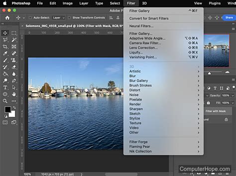
Filter > Noise > Add Noise. In the dialog box, choose "Gaussian" for a more natural distribution of noise and check "Monochromatic" to avoid colored speckles. Adjust the "Amount" slider left or right to control the density of the grain. Start with a moderate amount and refine it later.Applying Filters for Realism: To enhance the paper-like quality, you can apply further filters. Consider using
Filter > Stylize > Find Edgesfollowed byFilter > Blur > Gaussian Blurwith a very small radius. This can help create subtle lines and variations that mimic the paper's fiber structure. Alternatively,Filter > Texture > Texturizercan be used with a "Canvas" or "Burlap" preset to add a more pronounced surface effect, though this should be used subtly for a watercolor paper look.
Adjusting Tone and Depth:
Gradient for Depth: To adjust the darkness or lightness of your texture and give it more depth, apply a gradient effect. Select your texture layer, then go to
Layer > New Fill Layer > Gradient. Choose a gradient that goes from a lighter shade to a darker shade of your base color, or even a subtle sepia tone. Experiment with different gradient styles (Linear, Radial) and angles.Levels or Curves Adjustment: For finer control over the contrast and tonal range of your texture, use Levels or Curves adjustment layers. These can be clipped to your texture layer to affect only that layer. Adjusting the black, white, and gray points in Levels, or manipulating the curve in the Curves panel, can dramatically alter the perceived depth and realism of the paper grain.
Tweak and Refine:There are numerous ways to achieve the look of paper. Experiment with different filter combinations, blend modes for the noise layer itself (e.g., "Soft Light" or "Overlay"), and various adjustment layers. You might consider adding subtle "smudges" or "stains" using a soft brush on a new layer with a low opacity and a blend mode like "Multiply" to simulate the imperfections of real paper.
Incorporating Texture into Digital Paintings and Illustrations
Once you have a satisfactory watercolor paper texture, either created or sourced, the next step is to integrate it effectively into your digital artwork.
Applying to Existing Artwork:
Place Texture Layer: Import your texture image or your custom-created texture document into your artwork file as a new layer.
Position and Scale: Position and scale the texture layer to cover your entire artwork. You may need to use the Free Transform tool (
Ctrl/Cmd + T) to adjust its size and orientation.Blending and Opacity: As discussed earlier, experiment with blending modes like "Overlay," "Soft Light," or "Multiply." Adjust the opacity of the texture layer until it complements your artwork without overpowering it. A good starting point for watercolor paper texture is often between 10% and 40% opacity, but this will vary greatly depending on the texture's intensity and your artwork's style.
Layer Masks for Control: Utilize layer masks to selectively apply the texture. For instance, you might mask out areas where you want a smoother finish, or where the texture would look unnatural. This allows for precise control over where the texture is most prominent.
How to Create Watercolor Textures in Photoshop
Simulating Watercolor Paper for Digital Painting:
When painting digitally with the intention of mimicking a watercolor on paper, the texture becomes an integral part of the painting process.
Base Texture as Background: Instead of applying the texture at the end, consider setting up your watercolor paper texture as the background layer from the beginning. Paint directly on layers above it.
Brush Selection: Choose brushes that mimic the behavior of watercolor. Brushes with a textured or "dry brush" feel can help lift paint from the texture layer, creating realistic pigment accumulation in the "valleys" of the paper. Many artists create custom brushes that incorporate paper texture within the brush tip itself.
Layering and Transparency: Work with layers and transparency, just as you would with real watercolors. Building up colors gradually and allowing the texture to show through can create a very convincing effect.
Simulating Water Effects: Use brushes with varying opacity and flow to simulate water washes. The underlying paper texture will interact with these washes, creating natural-looking blooms and diffusion.
Advanced Techniques and Considerations
Fine Art Watercolor Paper Textures:For those seeking a more specific and high-fidelity simulation, searching for "Fine Art Watercolor Paper Textures" can lead to premium assets. These are often derived from scans of actual high-quality watercolor papers, offering an exceptional level of detail. Such textures might be used for digital prints intended to closely resemble physical artwork.
Paper Texture Brushes for Procreate + FREE BRUSHES:While this article focuses on Photoshop, it's worth noting that the concept of paper texture extends to other digital art platforms. For instance, Procreate offers specialized "Paper Texture Brushes" that can be downloaded. These brushes often have the texture built into their design, allowing for a more intuitive painting experience on iPads. The availability of free brush packs indicates the widespread demand for these effects.
Seamless Textures:When working with large canvases or when you need to tile a texture without visible seams, using "Seamless watercolor fabric baby pattern" or "PAPERS - Unique Texture Collection" that are specifically designed to tile is crucial. These patterns repeat without abrupt breaks, ensuring a consistent texture across your entire artwork.
"Kingdom of Faewood" Dust Jacket/Edge Papers:This example suggests that paper textures can be used not just for the main artwork surface, but also for elements like dust jackets or decorative edges, adding a layer of detail and realism to digital book cover designs or mockups.
Coral Watercolour Background Textures & Fall Autumn Watercolor Backgrounds:These specific examples highlight how watercolor textures can be used as backgrounds for graphic design elements, such as invitations, posters, or digital collages. The color palette (coral, autumn hues) indicates how textures can be tailored to specific themes and moods.
FREEBIE - Watercolor Ombre Texture:Ombre effects combined with watercolor textures are popular for creating smooth color transitions with a painterly feel. These are often used for web design elements, social media graphics, or as backgrounds.
Black Ink Backgrounds Vol. 4 & Flowers watercolor clipart:These entries suggest that watercolor textures can be a base for other artistic elements. For example, a black ink design might be placed over a subtle watercolor paper texture to give it a more grounded, artistic feel. Similarly, watercolor clipart can be placed on a textured background to enhance its visual appeal.
Children book cover illustration:The mention of "Children book cover illustration" further emphasizes the versatility of watercolor paper textures in creating engaging and visually appealing designs for various media. The texture can add a whimsical or classic feel appropriate for children's literature.
Procreate Watercolor Brushes & Paper:Similar to the Procreate brushes mentioned earlier, this reinforces the idea that integrating paper texture is a key aspect of digital watercolor simulation across different software.
WATERCOLOR GRUNGY TEXTURES:For a more distressed or aged look, "grungy" watercolor textures can be employed. These often feature more pronounced imperfections, stains, and a rougher feel, suitable for designs aiming for a vintage, artistic, or even slightly chaotic aesthetic.
Considerations Beyond Aesthetics: Performance and User Experience
While the focus has been on the visual aspect, it's important to acknowledge that some digital techniques, particularly those involving complex JavaScript or extensive image processing, can have performance implications. In the context of web scraping, for instance, certain methods to identify legitimate users might involve presenting challenges that require modern JavaScript features. Plugins like JShelter can disable these features, potentially hindering the effectiveness of such identification methods. The challenge proof of work page is designed to deter bots by presenting tasks that are computationally expensive or require human-like interaction, but at individual scales, the additional load these tasks impose might be ignorable. However, at mass scraper levels, this cumulative load can significantly increase the cost of scraping. This highlights a broader principle: even seemingly minor computational or visual elements can have significant cumulative effects when scaled.
The idea here is that at individual scales, the additional load is ignorable, but at mass scraper levels, it adds up and makes scraping much more expensive. Ultimately, this is a placeholder solution so that more time can be spent on fingerprinting and identifying headless browsers (e.g., via how they do font rendering) so that the challenge proof of work page doesn't need to be presented to users that are much more likely to be legitimate. This is a critical insight into how digital systems are designed to balance security, performance, and user experience.
Conclusion
Simulating watercolor paper texture in Photoshop is a nuanced art that can elevate digital creations from flat images to tangible experiences. By understanding the characteristics of real watercolor paper and employing Photoshop's versatile tools-from simple layer overlays and blending modes to custom texture generation with filters and adjustment layers-artists can imbue their work with a rich, physical quality. Whether you're a digital painter aiming for realism, a graphic designer seeking a unique aesthetic, or an illustrator developing a distinct style, mastering these techniques will undoubtedly enhance the depth, character, and appeal of your digital artwork. The continuous exploration of various texture sources, brush types, and integration methods will further refine your ability to achieve that sought-after authentic watercolor paper feel.
tags: #watercolor #paper #texture #photoshop