In the realm of professional printing, understanding the nuances of layout elements like margins and gutters is as crucial as mastering the intricacies of bleed. While often overlooked by novice designers, these seemingly simple blank spaces play a pivotal role in the overall aesthetic, readability, and professional finish of any printed material. This guide delves into the definitions, importance, and practical application of margins and gutters within Adobe InDesign, drawing upon established typographic principles and user-provided insights to ensure your designs are not only visually appealing but also print-ready.
Defining Margins and Gutters: The Unused Canvas
Both margins and gutters are essentially areas of unoccupied space on a printed page, often referred to as "negative space." Their primary function is to ensure that the intended content of your design is presented clearly and effectively, free from unintended visual clutter or technical printing issues.
Margins: The Frame of Your Content
Margins are the most straightforward of the two terms. They are defined as the space between the actual design content and the physical edge of the printed page. Think of them as the frame around a picture; they separate the information from the boundary of the paper, thereby framing and defining the "type area" - the zone where your primary content resides.
Margins serve several vital functions:
- Framing and Definition: They clearly delineate the content area, guiding the reader's eye and establishing the visual hierarchy of the page. Much like a well-executed mount can enhance a photograph's impact, well-considered margins can significantly elevate the perceived quality of your design.
- Handling: Margins provide a practical space for the reader to hold the printed material, whether it's a book, magazine, or brochure, without obscuring the content. Historically, these spaces were also used for annotations, a practice that still influences the design of scholarly works with their characteristically wide outside margins.
- Publication Information: Margins, particularly the top and bottom ones, are often utilized for essential publication elements such as page numbers (folios) and other identifying information.
Gutters: The Spaces Between Elements
The term "gutter" refers to various types of vertical spacing between different elements within a print design. Its specific meaning can vary depending on the context:
- Between Multiple Copies: When a single sheet of paper is intended to be cut into multiple individual prints (like business cards or postcards), the space separating each copy is called a gutter.
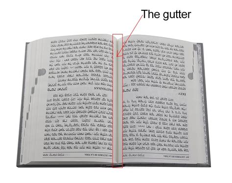
- Between Facing Pages: In multi-page documents such as books and magazines, the gutter is the space between two facing pages. This space is critically influenced by the binding method of the publication.
- Between Columns: When text or images are arranged in multiple columns on a single page, the space separating these columns is also referred to as a gutter. This is a common application within page layout software like InDesign.
The Absence of Strict Standards: Flexibility in Design
Unlike bleed, which often has more defined industry requirements, there isn't a single, universally mandated standard for margin or gutter dimensions. These measurements are flexible and can be influenced by several factors:
- Content Volume: A design with a lot of text or imagery might require smaller margins to maximize usable space, while a minimalist design might benefit from more generous margins.
- Aesthetic Intent: The desired look and feel of the final product heavily influence margin and gutter choices. Generous margins can convey a sense of luxury or simplicity, while tighter margins can create a feeling of density or urgency.
- Binding Method: For multi-page documents, the way the pages are bound (e.g., saddle-stitched, perfect bound, wire-o) significantly impacts the perception and functional needs of the gutter space. A perfect-bound book, for instance, will have a deeper gutter than a saddle-stitched booklet due to the adhesive binding.
However, a general rule of thumb for good design practice is to consider negative space - including margins and gutters - as an integral and intentional part of the overall design, rather than an afterthought.
Designing with Bleed, Margins, and Gutters in Mind
When your design incorporates elements that extend to the edge of the page (requiring bleed), it's natural to wonder if margins and gutters still matter. The answer is a resounding yes.
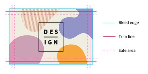
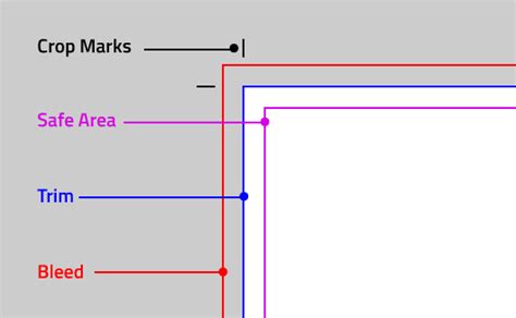
As illustrated, when bleed is applied, design elements extend beyond the intended trim edge and into the margin area. However, all critical information - text, logos, and important image details - must remain within the "safe area," which is defined by the margins. In this scenario, margins still function as essential blank space, ensuring that no crucial content is accidentally trimmed off. The bleed ensures that when the page is trimmed, there are no unprinted white edges.
Tools and Software for Precise Alignment in InDesign
Achieving accurate vertical and horizontal measurements for margins and gutters is paramount for a polished print product. Adobe InDesign, a leading software for page layout, offers a robust suite of tools to facilitate this:
Setting Margins and Columns in InDesign
When creating a new document in InDesign, you have the opportunity to define your margins and the number of columns right from the start. This is accessed via File > New > Document.
- Margins: Within the "New Document" dialog box, you'll find fields to set the top, bottom, inside, and outside margins. For facing pages (like in a book or magazine), you can set different values for the inside (gutter) and outside margins.
- Columns: Simultaneously, you can specify the number of columns for your page layout and the spacing between them - this spacing is your gutter.
Adjusting Margins and Columns Post-Creation
If you need to modify margins or column layouts after the document has been created, InDesign makes this straightforward:
- Navigate to Layout > Margins and Columns.
- In the dialog box that appears, you can adjust the margin values for the entire document or for specific sections.
- You can also change the number of columns and the gutter width between them.
To ensure consistency across your publication, it's often best practice to set these parameters on your Master Pages. Any changes made to the margins and columns on a master page will then be applied to all document pages that use that master.
Understanding the Gutter Setting in InDesign
In InDesign, the "gutter" specifically refers to the space between columns. When you set up columns in your document, the value you input for "Gutter" dictates the width of this space.
- Column Gutters: These are the spaces between columns of text or image frames. They are crucial for readability, preventing columns from appearing as a single, undifferentiated block of content.
- Document Gutters: While "gutter" most commonly refers to column spacing, the term can also be used more broadly to describe the internal margin in a spread, which is influenced by the binding. In InDesign's "Margins and Columns" dialog, the "Inside" margin for facing pages effectively functions as the gutter of the spread.
The measurement units for gutters (and margins) can be set to points, pixels, inches, millimeters, or picas, offering flexibility to match project specifications.
InDesign Margins & Columns
Guides: Visualizing Your Layout
Beyond the automated margin and column settings, InDesign provides powerful guide features for precise layout control:
- Ruler Guides: These are non-printing lines that you can drag from the horizontal and vertical rulers onto your page or pasteboard. They are invaluable for aligning objects and establishing visual consistency.
- To create a ruler guide, simply drag from the ruler into the document.
- You can create guides on the pasteboard as well, which can be dragged onto pages.
- Guides can be moved, duplicated (by holding Alt/Option while dragging), and deleted.
- For precise placement, you can enter specific coordinates in the Control panel or use the "Create Guides" command (View > Guides > Create Guides).
- Grids: InDesign also offers document grids (a grid of horizontal and vertical lines) that can be customized in Edit > Preferences > Grids. These grids can assist in aligning elements with a consistent spacing.
- Smart Guides: These dynamic guides appear automatically as you move or resize objects, snapping them into alignment with other objects, guides, or the document grid. They are incredibly useful for quick, intuitive alignment.
Managing Guides
- Showing/Hiding Guides: You can toggle the visibility of guides via View > Show Guides or by managing them within the Layers panel (Window > Layers).
- Locking Guides: To prevent accidental movement, guides can be locked (View > Guides > Lock Guides or via the Layers panel).
- Deleting Guides: Individual guides can be deleted by selecting them and pressing Delete. You can also delete all guides on a spread via Edit > Delete All Guides On Spread.
- Guide Color: Guides can be customized with different colors for better visibility, accessible through Edit > Preferences > Guides & Pasteboard.
Snapping to Guides
The "Snap to Guides" feature (View > Snap to Guides) is fundamental for precise alignment. When enabled, objects will automatically snap to the nearest guide when they are moved or resized, ensuring that edges or centers align perfectly. The "Snap to Document Grid" performs a similar function for the document grid.
Common Mistakes to Avoid with Margins and Gutters
The most prevalent error when working with margins and gutters is allowing critical design elements to encroach upon these designated negative spaces.
- Content Overlap: A common pitfall is letting text, logos, or key photographic elements drift into the margin or gutter areas. This can lead to illegible text, cropped logos, or visually jarring compositions.
- Treating Margins as Afterthoughts: Designing without a clear strategy for margins and gutters can result in a layout that feels unbalanced or unprofessional. Remember that these spaces are active design elements.
To mitigate these issues:
- Keep Guides Visible: Always have your margin and column guides turned on while designing. This provides a constant visual reference for the safe zones of your layout.
- Understand the Safe Area: Recognize that the area within your margins is the "safe area" where all essential content must reside.
- Consider the Binding: For multi-page documents, always factor in how the binding will affect the gutter. A generous inside margin is crucial for perfect-bound books to prevent text from disappearing into the spine.
Determining Margin and Gutter Dimensions: A Typographic Approach
While there are no rigid rules, established typographic principles offer guidance for setting effective margins and gutters.
Determining Margins
Margins are not merely blank space; they are active participants in the design.
- Proportion and Aesthetics: Margins are the first visual element a reader encounters. They set the tone and influence the initial impression of the page. Designers often strive for a harmonious relationship between content and surrounding space.
- A Popular Ratio: A commonly cited ratio for determining margins on facing-page documents is 1:1.5:2:2.25 for inside, top, outside, and bottom margins, respectively. This ratio aims to create margins that are generous enough to be visually pleasing and functional, yet familiar and comfortable for a contemporary audience. However, this is a guideline, not a strict rule, and should be adapted to the specific project.
- Variations for Facing Pages: Making all margins identical on facing pages can result in a static appearance. When pages are viewed as a spread, they share an inside margin at the spine. This "double margin" means the spread is often perceived as a single visual unit. Consequently, inside margins are typically the smallest, followed by the top, then the outside, and finally the bottom margin, which is often the largest to provide a stable base.
Setting Up Columns and Their Gutters
The type area, defined by the margins, can be subdivided into columns. The width of these columns, in relation to the type size, is known as the "column measure."
- Readability: The primary goal when setting columns is to ensure readability. Text frames (text boxes) must be wide enough to accommodate comfortable line lengths.
- Column Measure Guidelines:
- A general guideline suggests aiming for 45 to 70 characters per line (including spaces).
- Another common metric is a minimum of six words per line.
- A more technical approach uses two alphabets (52 characters) as a benchmark.
- Consequences of Incorrect Measure:
- Too Wide: If a column measure is too wide, leading to too many characters per line, the reader's eye may "double" back and reread the same line, hindering comprehension. Increasing leading (line spacing) can sometimes alleviate this.
- Too Narrow: Conversely, if a column is too narrow, especially when using justified type, achieving even spacing between words becomes extremely difficult, resulting in unsightly "rivers" of white space.
- Gutter Width and Leading: The space between columns (the gutter) should relate to the leading (line spacing) of the body text. To maintain visual harmony and uniform spacing, set gutter widths to be equal to, or a multiple of (e.g., 1.5x or 2x), the leading value. Wider columns generally accommodate wider gutters.
By thoughtfully applying these principles and utilizing the powerful tools within Adobe InDesign, designers can effectively manage margins and gutters, transforming blank space into a deliberate and impactful design element that enhances the overall quality and professionalism of their printed work.